I was the researcher and designer, I handled everything from initial research and concept development to the final design and usability testing. My role included brainstorming the concept, designing the system’s architecture, and iterating on the design based on user feedback.
The target audience was primarily students who spend long hours working or studying, often in the same seated position. These users tend to be tech-savvy, health-conscious, and interested in using technology to improve their well-being.
Students tend to stay seated for long durations while studying or using their laptops, which leads to postural problems, musculoskeletal pain and/or repetitive strain injuries.
Contexts of working: sitting/ typing/ writing/ using the mouse, etc.
An IoT system that encourages healthy work habits by monitoring sitting posture and reminding users to take breaks, stretch, and drink water—ensuring the user maintains well-being while staying productive.
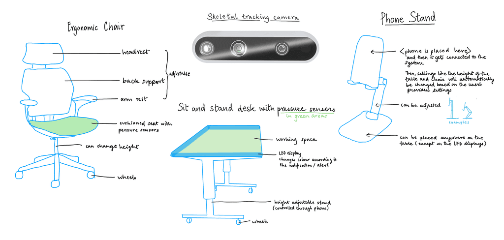
Camera
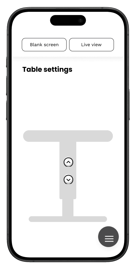
Pressure sensors on table and chair
Small screen that prompts user for breaks/ exercises
Web and mobile application
Monitors posture and nudges users to correct it.
Records duration of work session and sends notifications to take breaks.
Suggest exercises to prevent and/or relieve sedantary pain.
Introduces a health bot buddy to make the reminders more personal and engaging
I conducted generative research to ensure my idea would effectively solve the problem and to better understand my users. I gathered insights from my target audience: students who, like me, often spend long hours working in one position.
Students who tend to work/ study/ sit in the same place for long durations.
Lifestyle — working / using laptop for long durations
Opinion on the proposal
Exploring the technology
They wanted the system to be customizable, with avatars, colors, and sounds for friendly reminders.
Participants liked the idea but were uncomfortable with a camera monitoring system.
They requested that reminders be more friendly and engaging, incorporating characters.
Based on that I refined the problem statement to focus on what exactly the audience needs and why:
Users’ health is being impacted due to long working hours and unsuitable working style. Hence they need a system to monitor them to ensure that they maintain good habits and avoid bad habits while working. Their main goal is to work without affecting their health (avoid pain due to bad posture, stress eating, etc).
Ensures right posture
Nudges to do exercise/ move
Help build healthy habits like
Regularly drinking water
Not overeating when stress levels are high
Health bot buddy, similar to Siri-can talk to the users about things they want
Their tasks for that day
Their habit goals
Help the user focus- cut down distractions
Replaced the camera with a skeletal tracking system to address privacy concerns.
Show the history of user's postures and durations they work for.
Integrated a more playful element with the health bot buddy, which interacts with users in a friendly, conversational way.
Added personalization options like avatars, sound reminders, and color schemes.
To bring the system to life, I created visualizations of how the IoT system would integrate with a physical space. The room would offer a big enough area for users to work, stretch, and exercise, creating a holistic environment that encourages healthy working habits. The space will have everything the user needs to have a relaxed and healthy work session.

With the parts and their functions ready, I created the prototypes.
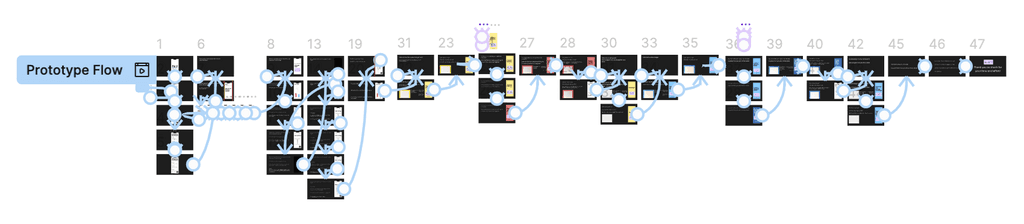
Testing was crucial to refine the user interaction and overall functionality. In the usability test, the phone screen as the only form of communication between the user and the system. Also, I used painted paper to mimic LED lights that are the subtle notifications users would receive. The study was conducted by first walking the participant through the space visualization photographs and then showing them a presentation asking for their input and sometimes asking them to complete certain tasks.
Straightforward interface.
Relatively easy to understand, especially the nudge notifications.
The last screen which shows up after the user acts on the nudge should be of another color like green because even if the user doesn’t look at the text they will still know that they have completed the action required.
Adjusted the colors to signal success more clearly, using green after a user completes a task.
Refined the interface, ensuring that avatars dynamically respond to user actions (e.g., avatars getting “sad” if users ignore reminders).
Added subtle visual cues to ensure notifications don’t feel disruptive but still grab the user’s attention.
The final system was an engaging, health-focused IoT space that encourages users to maintain good posture and healthy habits through playful, yet functional, interactions. By combining real-time monitoring with personalization options, the system creates a more enjoyable way for students to stay productive without sacrificing their well-being.


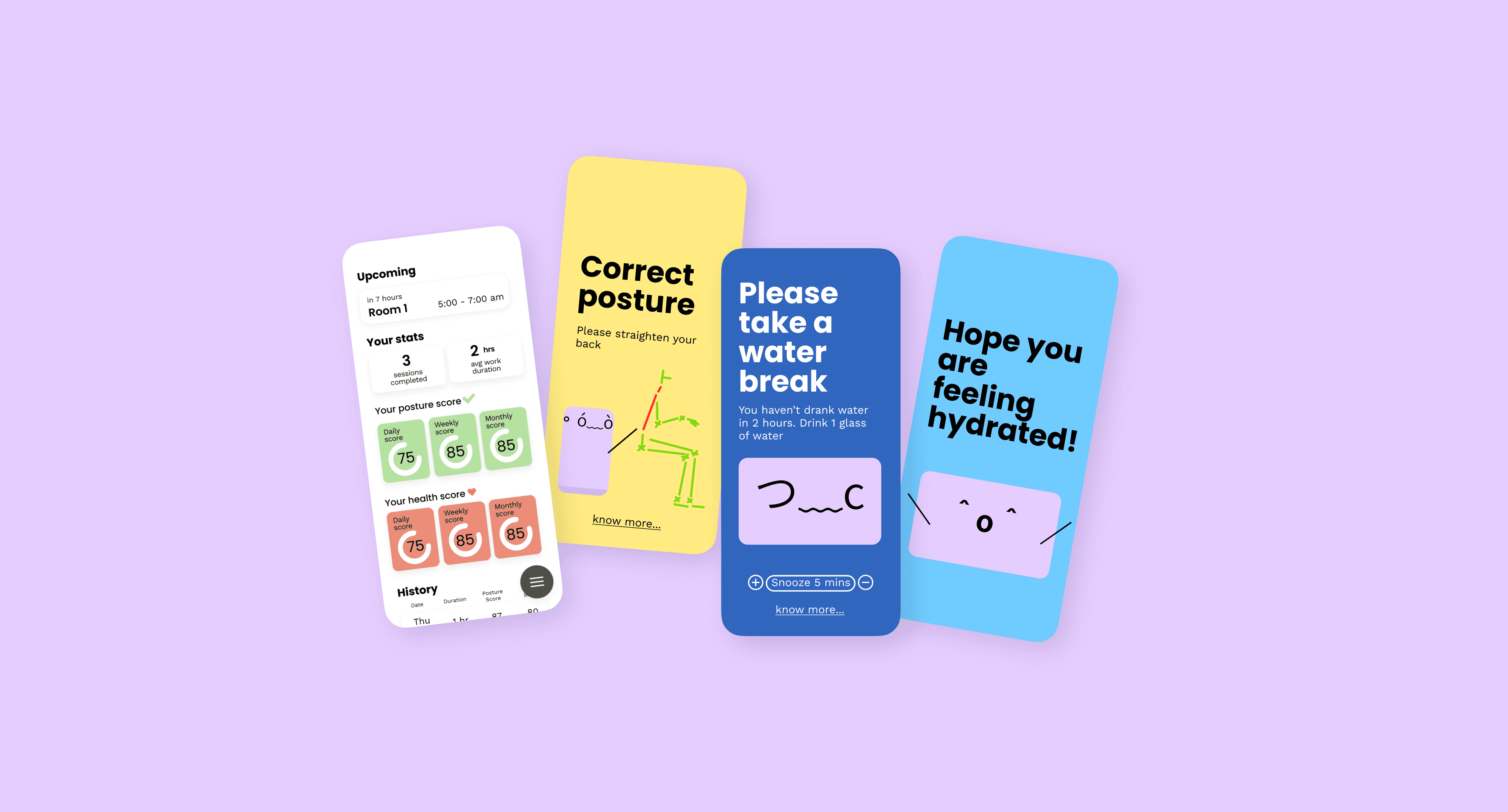
Correct posture
Please straighten your back
know more...
。

ó﹏ò
9:41


The avatar shows the problem with the posture
The user has been slouching for 2 mins
The display on the table turns yellow
know more...
>﹏<
Please change posture
Straighten your back
9:41

Avatar in pain
The user doesn’t move and keeps slouching for 2 more mins
The display on the table turns red
ノ﹏ヽ
Drink a glass of water
know more...
Snooze 5 mins
9:41
Sad avatar

The display on the table turns blue
The user hasn’t drank water in a long time
つ﹏c
Please take a water break
You haven’t drank water in 2 hours. Drink 1 glass of water
know more...
Snooze 5 mins
9:41
Upset avatar
The user ignores the notification and doesn’t drink water
The display on the table turns red
You are currently slouching which can cause neck pain, back problems, and other aggravating conditions
To attain the neutral spine position, put your shoulders down and back, pull your head back, and engage your core muscles
Keep your back straight and lean forward at the hips
Try to maintain a neutral, upright spine position — not flexed too far forward or backward.
Knowledge Base
9:41
Getting more information on the change the user needs to bring.
Drinking water can prevent dehydration, a condition that can cause unclear thinking, result in mood change, cause your body to overheat, and lead to constipation and kidney stones.
Water helps your body:
Keep a normal temperature.
Lubricate and cushion joints.
Protect your spinal cord and other sensitive tissues.
Get rid of wastes through urination, perspiration, and bowel movements.
It’s commonly recommended that you drink eight 8-ounce (237-mL) glasses of water per day (the 8×8 rule).
Knowledge Base
9:41
Getting more information on why drinking water/ water breaks are important
⌒▽⌒
Great job!
9:41
Happy avatar
The display on the table turns off
The user straightens their back
Hope you are feeling hydrated!
\
^o^
/
9:41
Happy avatar
The display on the table turns off
Getting more information on why drinking water/ water breaks are important
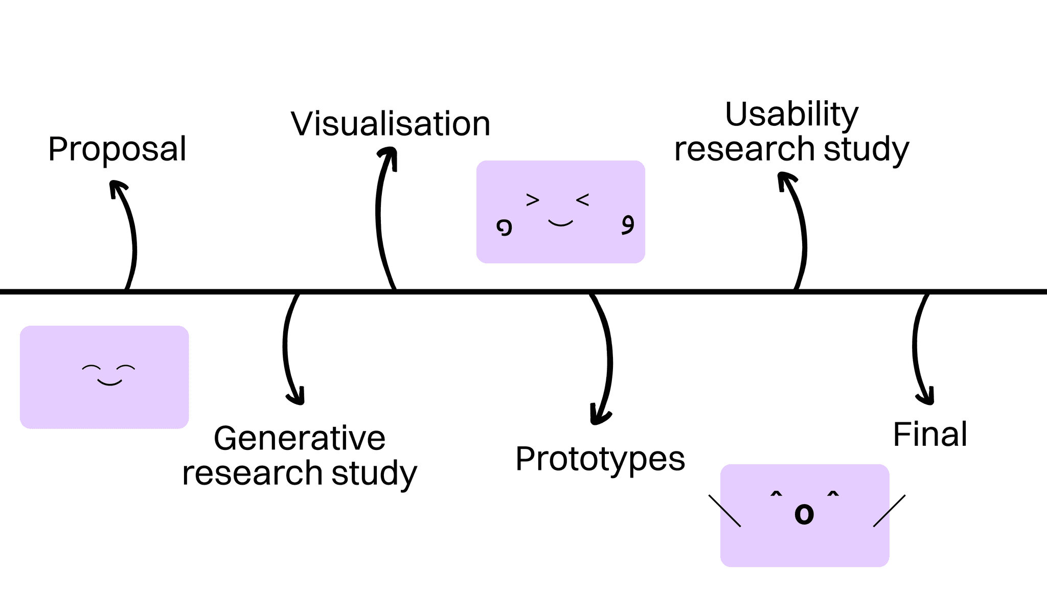
This project reinforced my belief in designing solutions that are not only functional but also human-centric and fun. The key to its success was combining careful planning with an open mind for experimentation, all while keeping the user’s needs front and center.
Planning was key in shaping this project. I learned how important it is to organize and prioritize elements to create a clear, user-friendly app experience. planning to know what elements to add in the app. for showing only 2 key processes- had to jot down all info first and then decide what screens to focus on. app architecture
Finding inspiration for app design to inform how certain elements can be shown
inpiration helped with desiging the status page. this concept doesn’t exist so needed inspitration for the home page. Took ideas from fitness apps
Playful design elements like avatars and customizable reminders can make functional solutions more engaging and enjoyable for users.
User research revealed the importance of privacy and customization. The initial design evolved into something more user-centric as I adapted the technology to fit user concerns.
Showing prototype in a presentation using figma so its clickable. New method. Explaining concepts rather than testing the product directly. Testing is more about learning about the users than the interface.
Mindmaps helped with sorting thoughts and flow diagrams helped visualise the user’s journey in interacting with the system, if they follow the notification or not. They informed all use cases to help design the screens. Helped in planning which screens need to be designed, making the design more intuitive.
Users quickly form certain emotional connections with certain colors and these connections can be different for different people. Red can be intimidating for some but for others it seems appropriate for warning notifications. Users were immediately able to relate red is more important than yellow and noticed that the screen after successfully acting on the alert should not be red or blue but green.Choosing the right color for each interaction was crucial to ensure they understood the system’s notifications at a glance.
Was thinking of introducing voice based control to remind the user and talk to them like a health bot buddy concept.
