
Upon looking at multiple ideas for mashups (like Uber+Duolingo, Uber+Camera), I decided on trying something different, designing for people I don’t relate to, to challenge myself:
When photography enthusiasts are exploring or taking unexpected trips, they often struggle to find both stunning locations and easy navigation.
They often have to switch between different apps for navigation, location discovery, and photo sharing.
Wander is a handy tool for them in this situation. They can easily discover scenic spots shared by fellow enthusiasts, navigate seamlessly, and capture beautiful moments creatively.
How can we help photography enthusiasts in their community deal with discovering and capturing beautiful moments?
Explore. Navigate. Create — Wander,
Your seamless journey to finding and photographing stunning moments with the help of a community of fellow enthusiasts and creative photo tools.
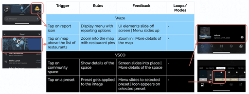
To design Wander, I researched and analyzed the parent apps’ core purposes, features, and user interactions. My goal was to take the best micro-interactions and design patterns from each, ensuring they complement each other well in the new app.


Provide navigational assistance, real-time traffic updates, and route optimization to drivers
Specializes in creative photo and video editing, doubling as a social platform for users to share their edited visuals
Individuals who drive regularly, such as daily commuters, long-distance travelers, and anyone seeking efficient and real-time navigation information
People who love artistic photos abd videos and want to express themselves creatively through editing and sharing.
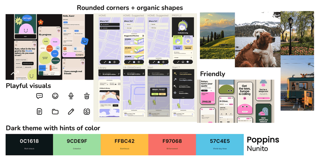
Playful, friendly
Professional, minimal
Microinteractions are small, subtle changes that happen when the user interacts with a trigger. They convey something to the user, like showing the system is working, preventing mistakes, or adding a bit of the brand’s personality to make the interaction more clear and enjoyable.
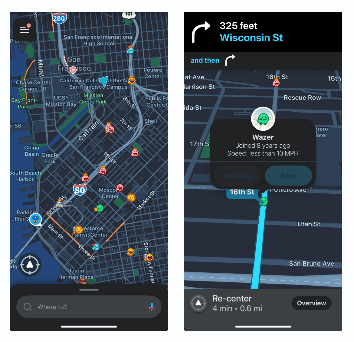
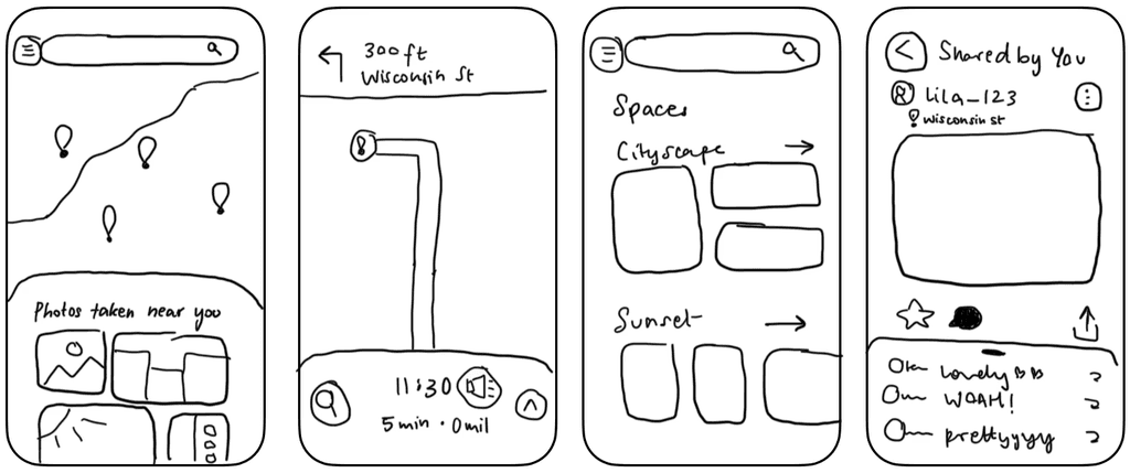
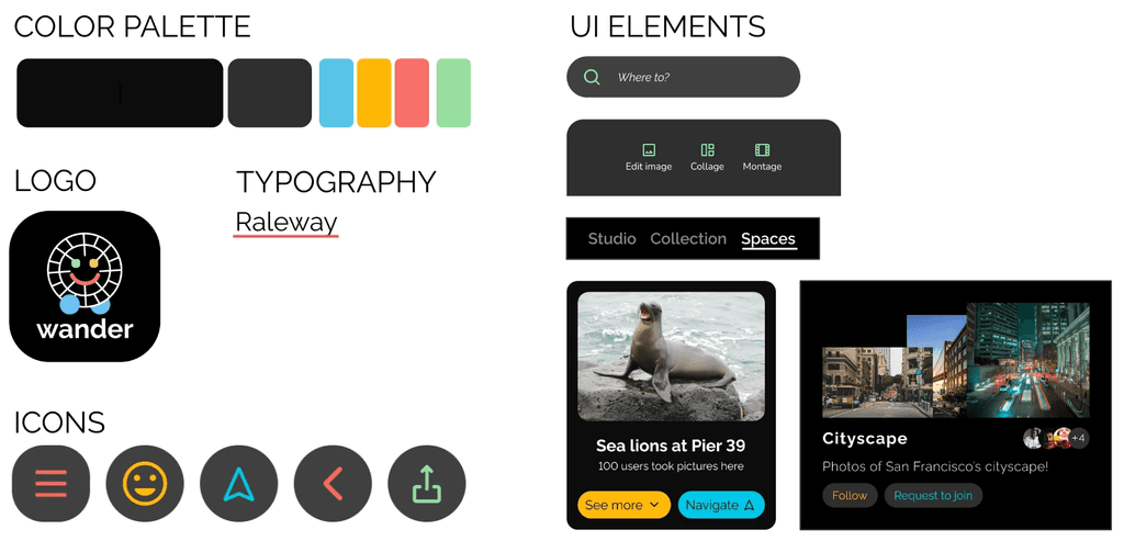
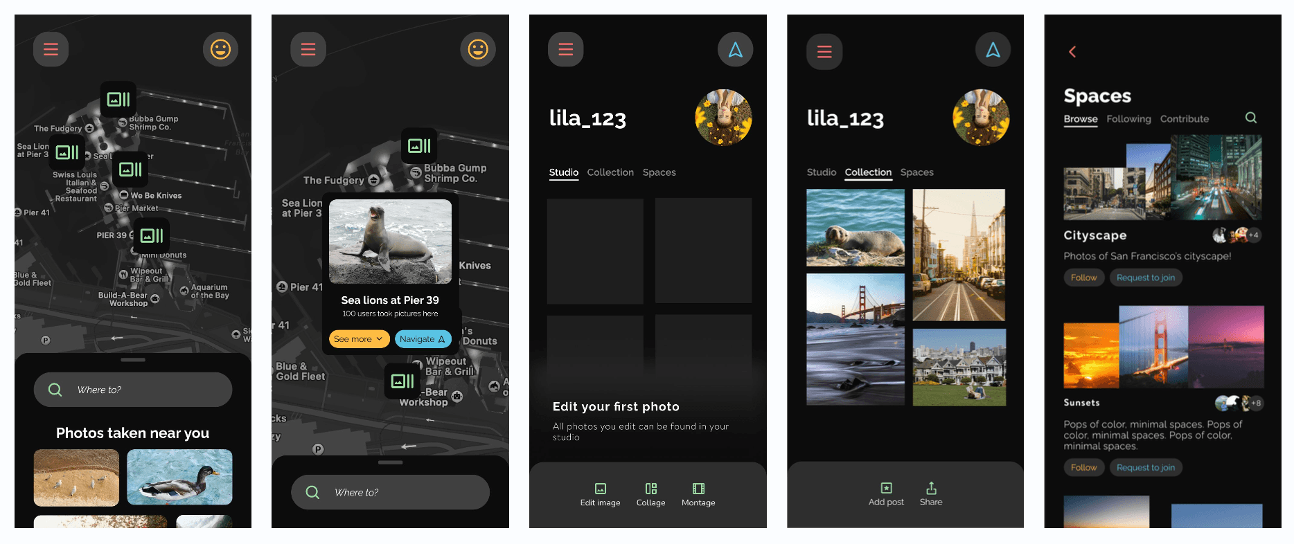
Map
Location search
Navigation
Clicking on other users cars will become clicking on locations that have been marked as photographic by other users
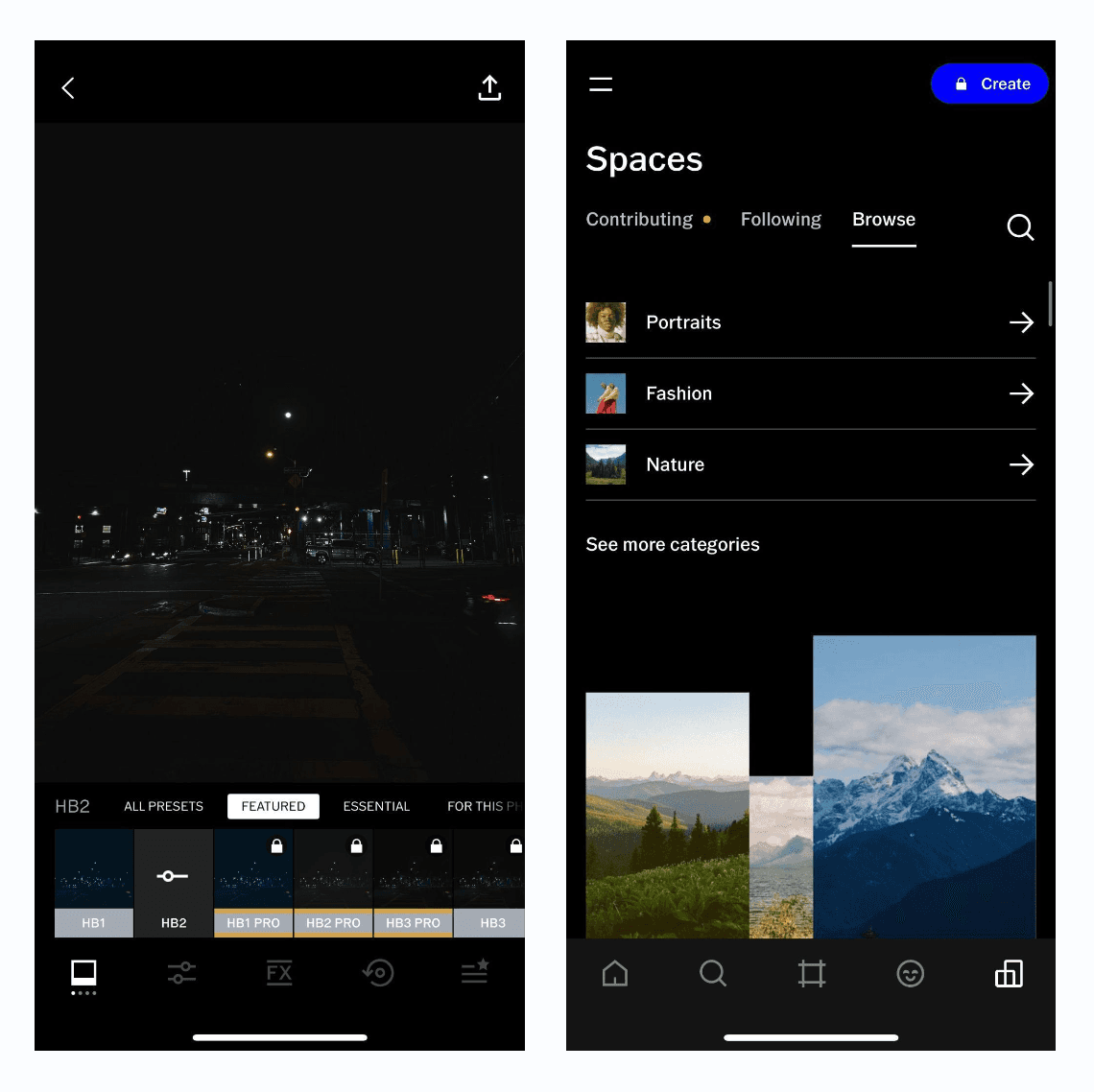
Photo editing tools
Community space to join and share photos
Discover photos clicked by other people (and the locations the photos were clicked in)
Before making the app, I used storyboards and moodboards to guide the content and visuals for the screens.
Since this project was from the behavior class. We applied the behavior theory to make sure the app motivated the intended behavior. This is a super-useful concept to remeber for making sure the app is a hit!
B (behavior occurs when) = MAP (motivation, ability, and prompt come together at the same time)
Wander improves both motivation and ability by makes photography more fun by bringing people together, helping them explore exciting places, and simplifying ways to be creative with photos.
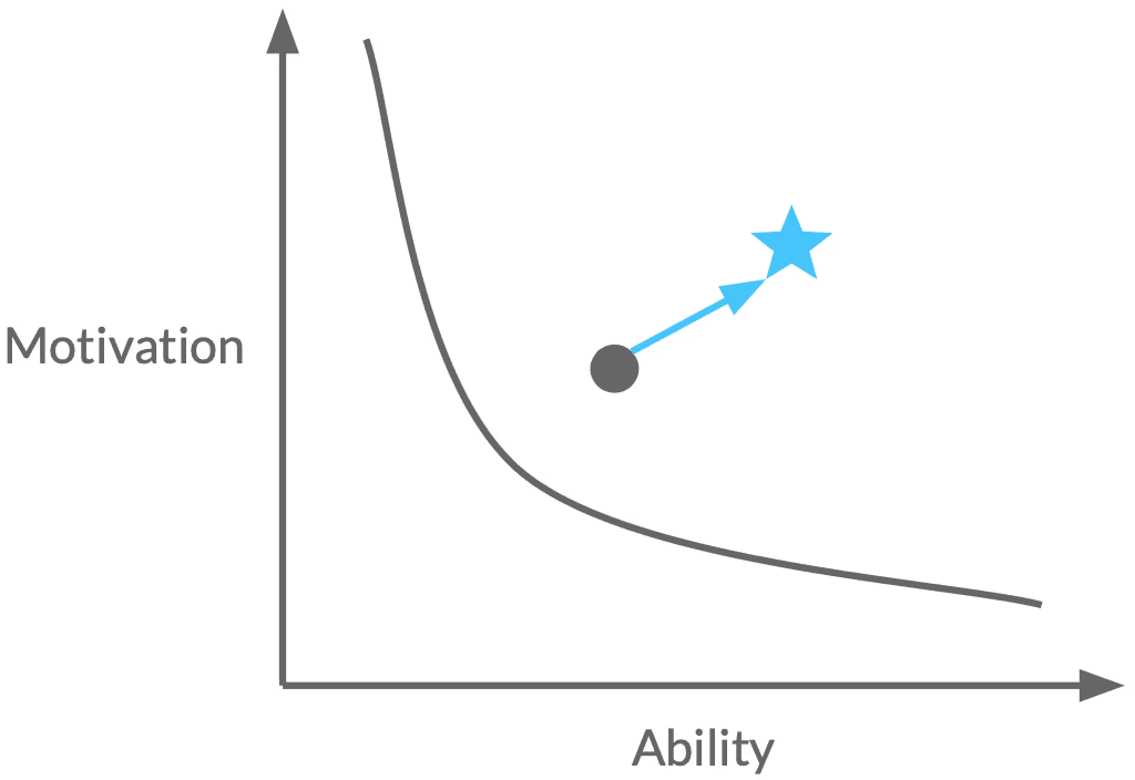
Improves both motivation and ability
Makes photography more fun by bringing people together, helping them explore exciting places, and simplifying ways to be creative with photos.
The part where my idea really comes to life! I made the app and animated the video to advertise the app.
I focused on creating a visual system and a prototype to ensure a smooth and inspiring onboarding experience, using storytelling and animation to engage the user from the start. The app’s appeal to users like Lila would be triggered through social media and word-of-mouth, with influencers sharing their discoveries from Wander, and friends recommending it for its unique features.
Whats the first time user experience: as the name suggests it is the first time the user interacts with the product and it is necessary to create a good impression and also hook the user to make sure they come back.
How might we ensure that first-time users feel connected to their passion for photography & feel inspired?
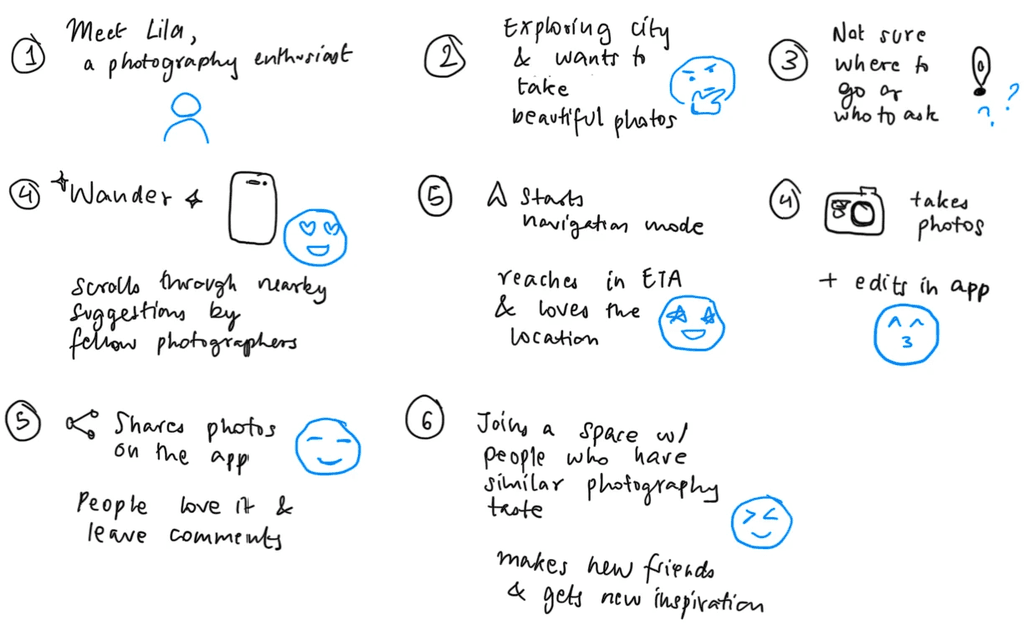
Lila, a photography enthusiast who loves exploring and capturing beautiful moments
Demographic
Young adults (18-26)

#Photography📸
#Travel✈️
#Explore🗺️
Find 🔍 new photography spots.
Connect 🔗 with fellow photographers.
Improve photography 📷 skills.
Finding 🔍 inspiration and time 🧭 easily.
Balance hobby with studies 📚📚📚.
Goes out every weekend
Has extra time
Instagram for inspiration
The app’s appeal to users like Lila would be triggered through social media and word-of-mouth, with influencers sharing their discoveries from Wander, and friends recommending it for its unique features.
Influencers Lila follows post content from Wander
Close friend also shares seeing interesting places on the app
When the user opens the app, they are prompted to become a Wanderer by sharing their mobile number.
Most people tend to skip sharing contact information when they haven't tried the app yet. Next step is to get their location so that the photographic spots around them can be shared.
Investment: Location permission
The tutorial starts by introducing the features of Navigate Mode. Here they can explore photography spots.
The member-only feature requires them to become a Wanderer. The user signs up with their mobile number.
The app uses multiple variable rewards in the form of in-app awards and recognitions.
Investment: Contact information
Variable reward: Gained access to member-only content
To avoid overwhelming the user with tutorials. The tutorial ends with telling them where to access the tutorial later.
The user explores studio mode on their own, earning more variable rewards and invests more by allowing push notifications.
Investment: Notification permission
Variable reward: In-app award/ recognition
How do we nudge the user to use the app again?
Activity in followed/joined spaces
Likes on uploaded photos
Follow requests
By adding external triggers I remind the user of the app, making them open the app again.
1 week later. Lila plans for another trip over the weekend and remembers Wander. She notices that the app has also pushed a notification:
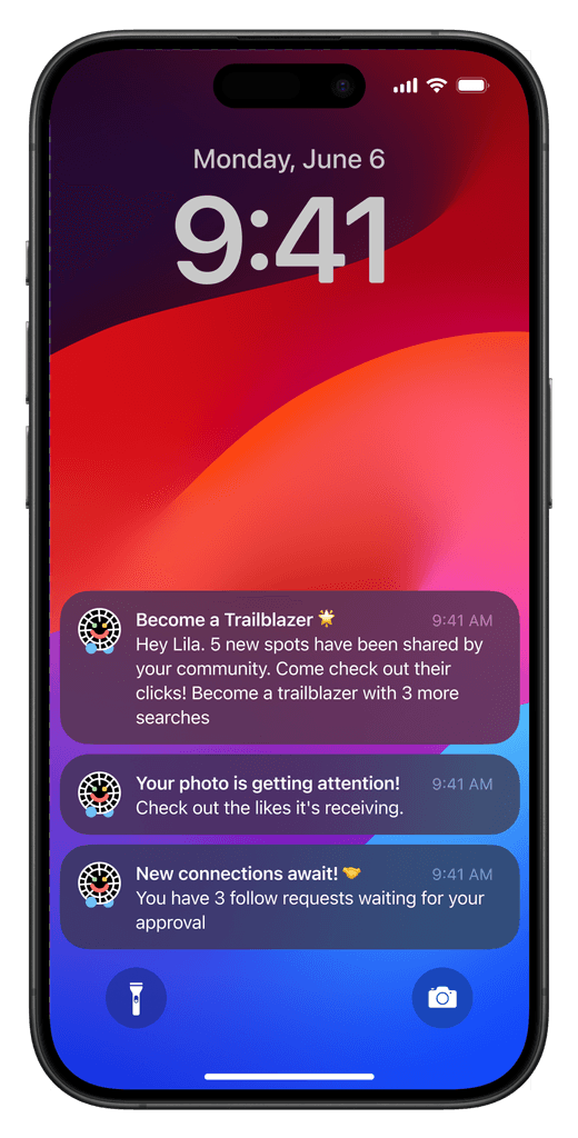
More examples of possible notification triggers.
Who doesn’t like knowing how successful they are in their goals? To see that the FTUE is successful I would need to measure the following:
# app downloads
# navigations completed
# spaces joined/ followed
# photos uploaded / liked
This case study shows how design, behavior theory, and micro-interactions can combine to create a product that resonates with its target audience and encourages ongoing use. By creating a product that is more than just the sum of its parts, I learned how to deliver a thoughtful and effective user experience.
Importance of knowing the underlying context of use
This project taught me the importance of understanding the user’s context and crafting experiences that not only engage but also resonate with their passions. From the other presentations in my behavior class, I learned how different behavioral models can be applied to various contexts to influence user behavior effectively.
Creating a good first time experience
Learned what information should be considered when creating FTUE; it is good to understand from where the user is coming to the app from and what they are looking for to help them stay/ use the app again.
Different behavioral models
From the other classmates’ presentations, I learned the different behavioral models applied to different contexts.
