
I designed the user interface and experience for a mouse setup application, focusing on creating an intuitive and minimal workflow for customizing settings.
Comfort-conscious multitaskers, such as graphic designers and gamers, who need a seamless way to adjust their mouse settings. These users value efficiency and customization, requiring an easy-to-use interface that adapts to their workflow.
Since my target audience is multi-taskers, I decided to make a game for configuring DPI that would be useful for them to adjust mouse sensitivity for their various tasks.
For inspiration, I created a moodboard. I looked for playful graphics and funny characters, like animals with big noses. The bright colors and 2D aesthetics of some games caught my eye, so I decided to make a game about jumping over blocks. I also got the idea to add flashy visual effects like explosions to make the game look more fun.

CheeseQuest is a game specifically designed to help users fine-tune their mouse's DPI (dots per inch) or sensitivity. In this game, players take control of Sniffer, a mouse character on a mission to reach his favorite food - cheese. To move Sniffer, the user must click on the target, which has a countdown that appears as Sniffer approaches it. If the user fails to click on the right spot before the time runs out, they will fail the game and must readjust their DPI to try again.
The game has different levels, each with more targets to click on. The user has to pass three levels to find the best DPI for them. CheeseQuest makes testing mouse settings amusing by combining quick and accurate clicking to help users find the perfect balance!
User stories are a key tool in UX/UI design, drawn from Agile and Scrum methodologies, and help keep the design process focused on real user needs. They break down the user’s identity, their goals, and why those goals are important, which helps prevent the design from becoming too complicated. By defining user stories, I can ensure the features align with what users actually want and need. This also enables collaboration within teams to work towards shared objectives and prioritize improvements effectively.
As a graphic design student and gamer I need customizable DPI settings so that I can adjust precision according between diverse tasks, from intricate design work to gaming.
As a graphic design student, I need to be able to customize buttons so that I can assign shortcuts for frequent tasks or applications.
As as a graphic design student and gamer, I need to be able to customize gestures for the multi-touch surface so that I can navigate the canvas more naturally and efficiently.
A user flow diagram is a visual map that outlines the steps a user takes within an app, helping ensure a smooth, logical experience. It helps designers identify potential roadblocks or confusing moments, improving the overall user journey. This tool is crucial for planning and collaboration, keeping the focus on users’ needs.
I created these diagrams to guide the content flow on each screen of my app, ensuring clarity and ease of use:
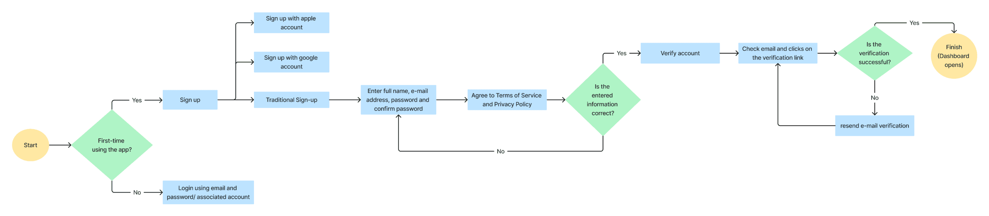
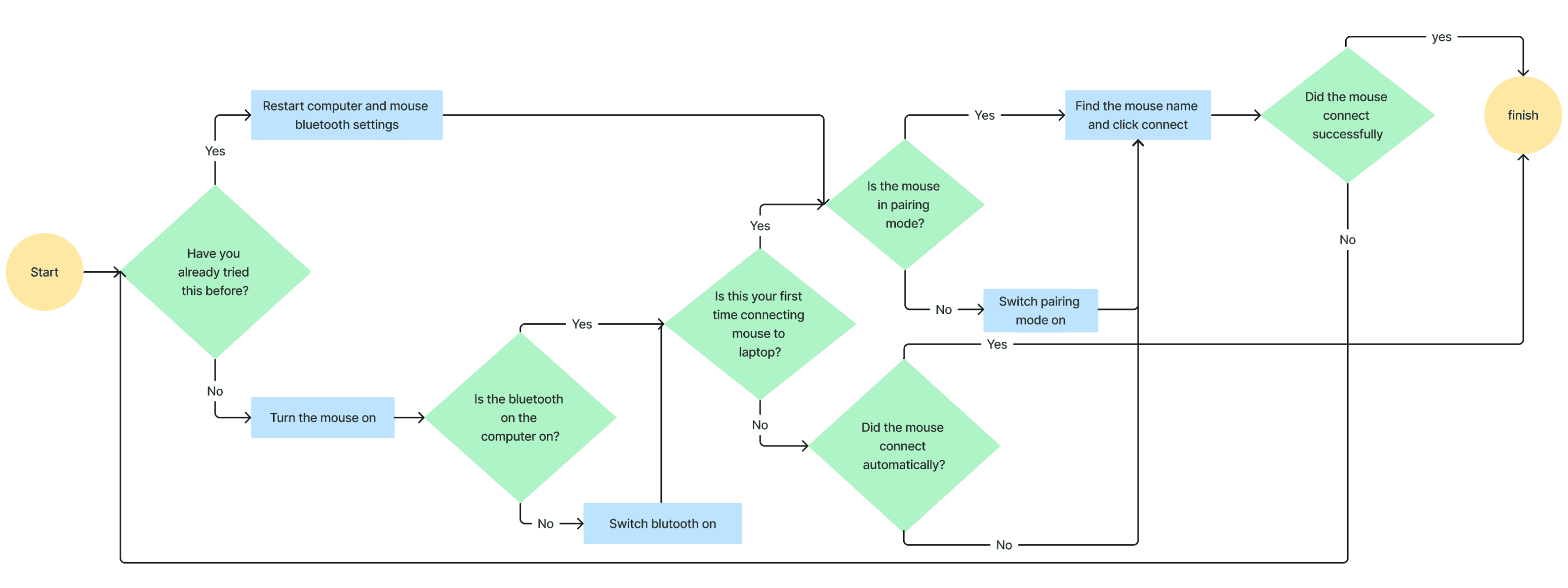

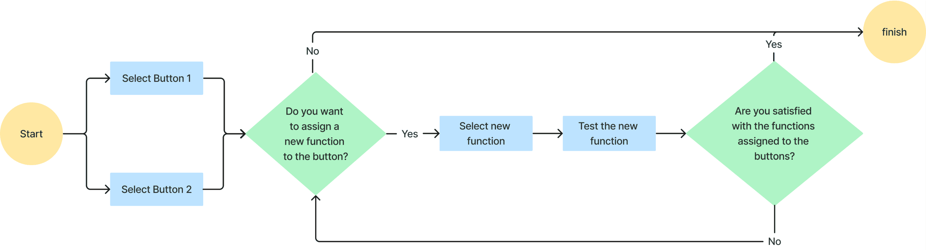
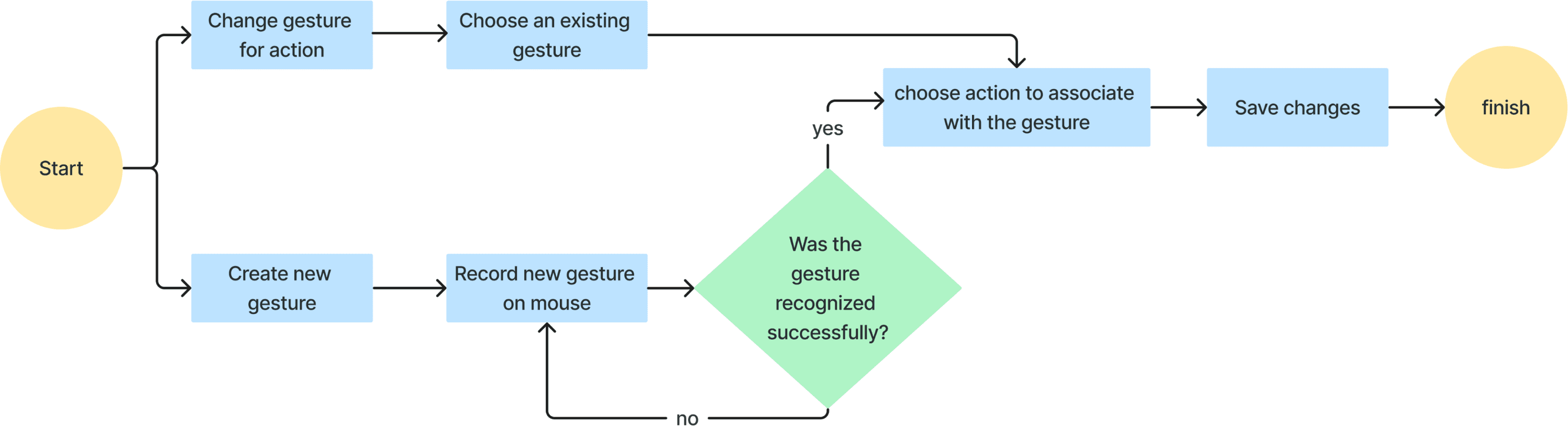
Wireframes are simple, structured blueprints that outline an app’s layout, navigation, and functionality. They focus on the structure and user flow, not the aesthetics, ensuring we prioritize user experience before diving into design details. My wireframes start with a login and account creation page, followed by a streamlined home page with two key settings: precision control and touch/button mapping. Precision control can be adjusted via a slider or a game called CheeseQuest, while the touch and button mapping allows users to customize gestures and buttons. The wireframes were designed to be clear and intuitive, keeping the user’s needs at the forefront.


By incorporating these inputs, I was able to polish my Mouse Setup application to create a more seamless and enjoyable experience with a focus on user-centered design and addressing specific concerns for a clearer, more intuitive interface.
The design looks minimal and very neatly organized!
The varying orientation and positioning of the mouse picture in different screens is confusing.
There is inconsistency in design - the 'reset changes' and 'save' buttons should be on all settings pages, in the same spot.
It is expected that the user is directed to the home page after saving DPI settings.
There should be labels for the components in the 'touch and button mapping' screen.
Adding tabs for the 'standard gestures' and 'custom gestures' will help indicate that their content is different.
A success message should appear to signal that Button 1's function is set.
In the 'Touch and Button Mapping' page, adding labels for the different components would be helpful.
A dropdown should be placed on the page where the user creates a new gesture to select the function of the gesture.
'Create new gesture +' doesn't look like a button.


I used grid systems to design simple, functional screens that align with the app’s needs. This helped create a cohesive look even when I wasn’t inspired by specific layouts. The design focused on user experience with minimal distractions.
Through user testing, I made adjustments to ensure the app was easy to use while keeping the important features front and center. Testing helped me simplify the design, making sure it worked well for the target audience. It also improved navigation and functionality.
I would test with actual users from my target group to fine-tune the app further. I’d experiment with color palettes, adjust button placements, and explore different design ideas. Continuous iteration would ensure the design remains intuitive and user-focused.
