
CowBella Farms
Creating a new visual design system
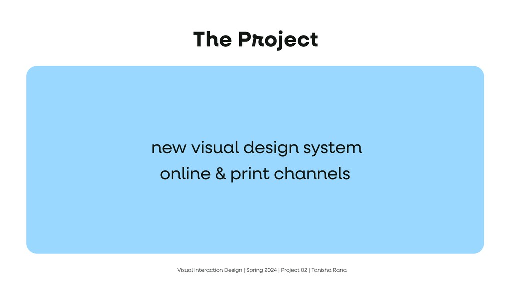
To design a new visual design system, including a logo, typography, color palette, and UI elements, that reflects CowBella Farms’ ethos of being all-natural, communal, and delightful. The goal was to ensure the brand identity resonates across various online & print channels, such as posters, mobile screens, and a website landing page.
Course
Visual User Interface and Experience: Core IXD Studio
Duration
3 weeks
Tools used
Figma
Illustrator
Skill highlights
Competitor research, Problem Solving, Team collaboration
Our
Wallpapers


Example 01:
Horizontal scroll with sticky positioning and scroll transforms.


Role
Sole designer. Collaborated with classmates for market/competitor research and brand analysis.
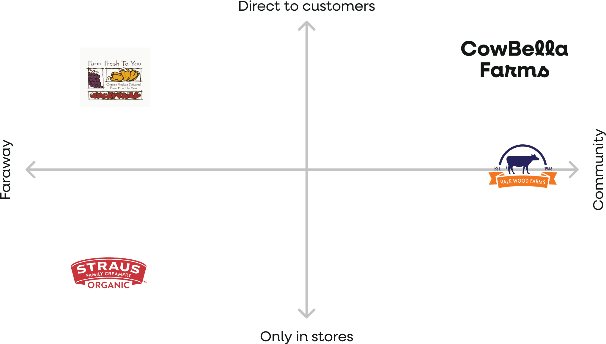
About the brand
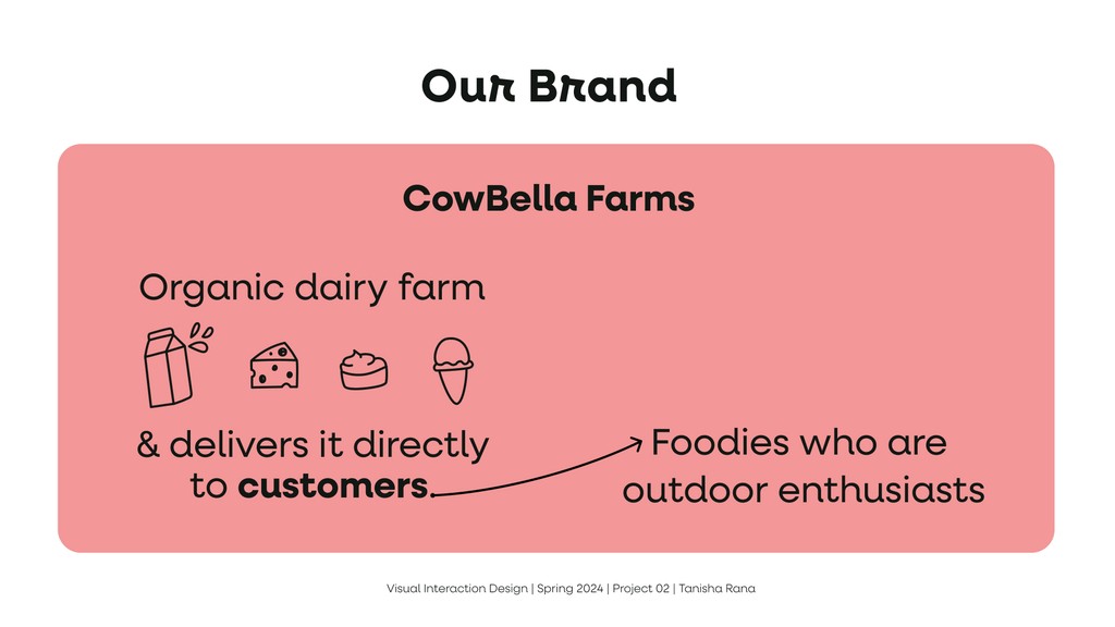
Cowbella farms
Organic dairy farm
& delivers it directly to customers~
Foodies who are outdoor enthusiasts
Our Belief
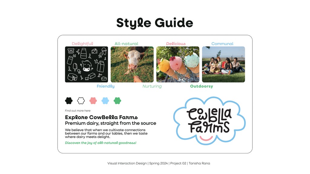
When we cultivate connections between our farms and our tables, then we taste where dairy meets delight.
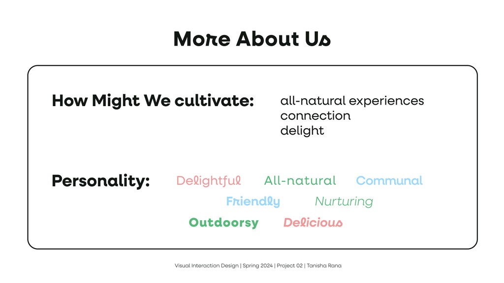
How might we cultivate:
all-natural experiences?
connection?
delight?
Personality

Design Process
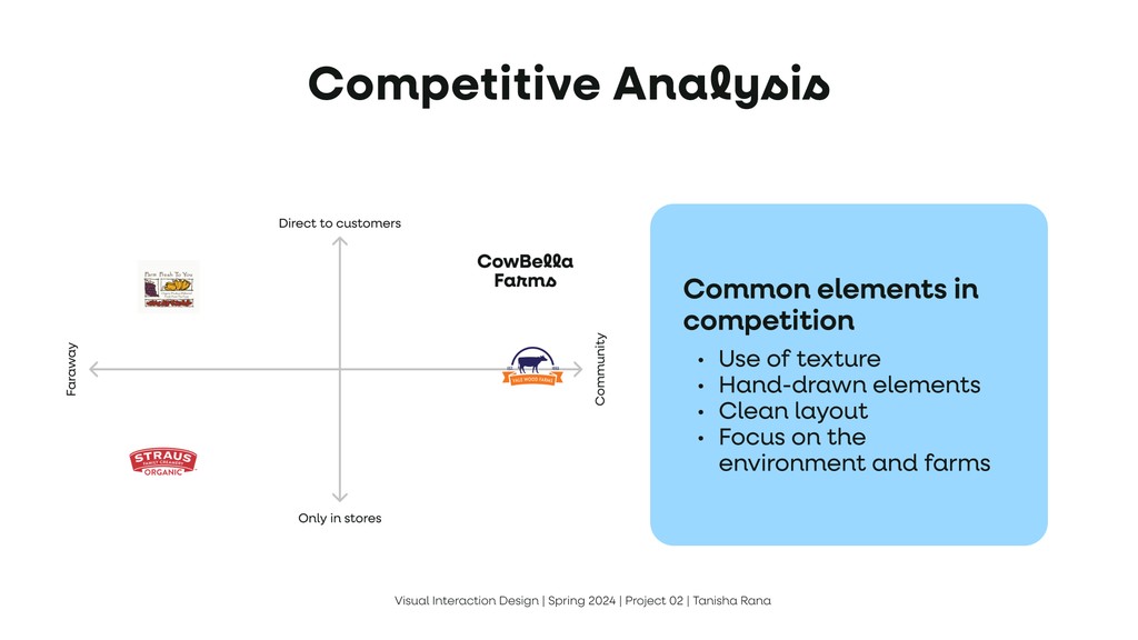
Common elements in competition
Use of texture
Hand-drawn elements
Clean layout
Focus on the environment and farms
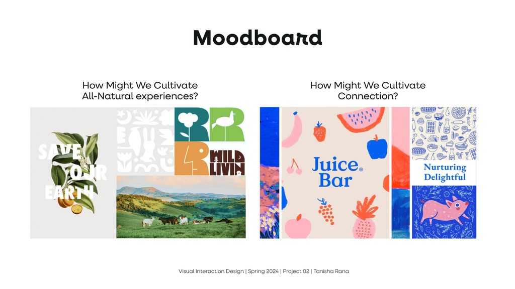
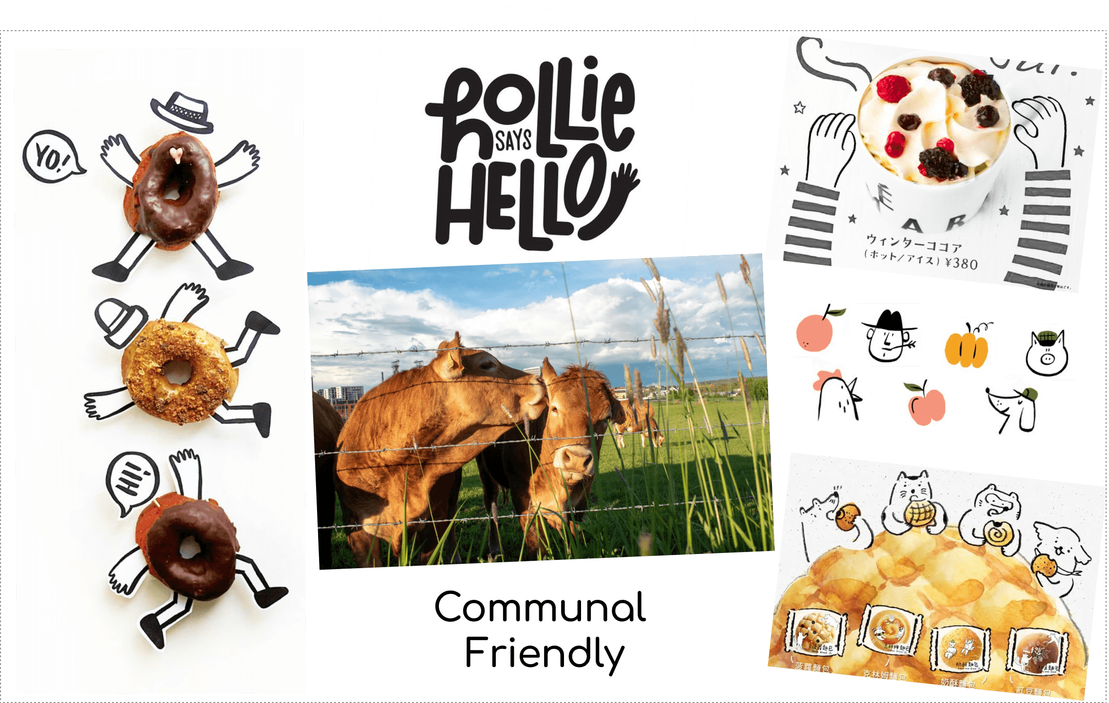
Moodboard

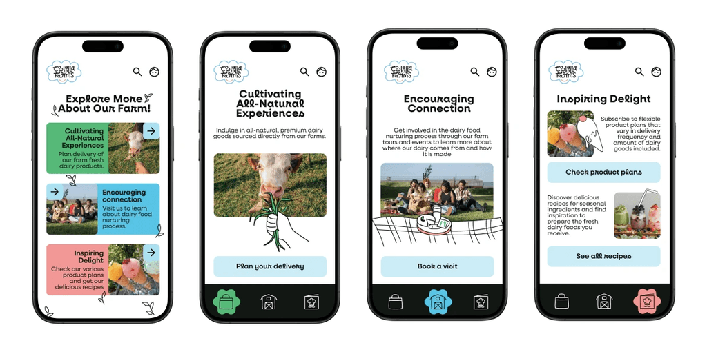
How might we cultivate all-natural experiences?

How might we cultivate connections?
How might we cultivate delight?

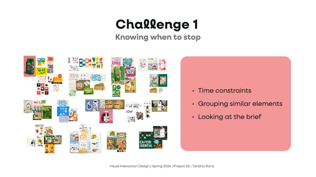
Challenge
Knowing when to stop
Time constraints
Grouping similar elements
Looking at the brief
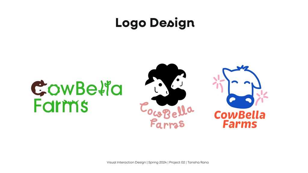
Logo Design


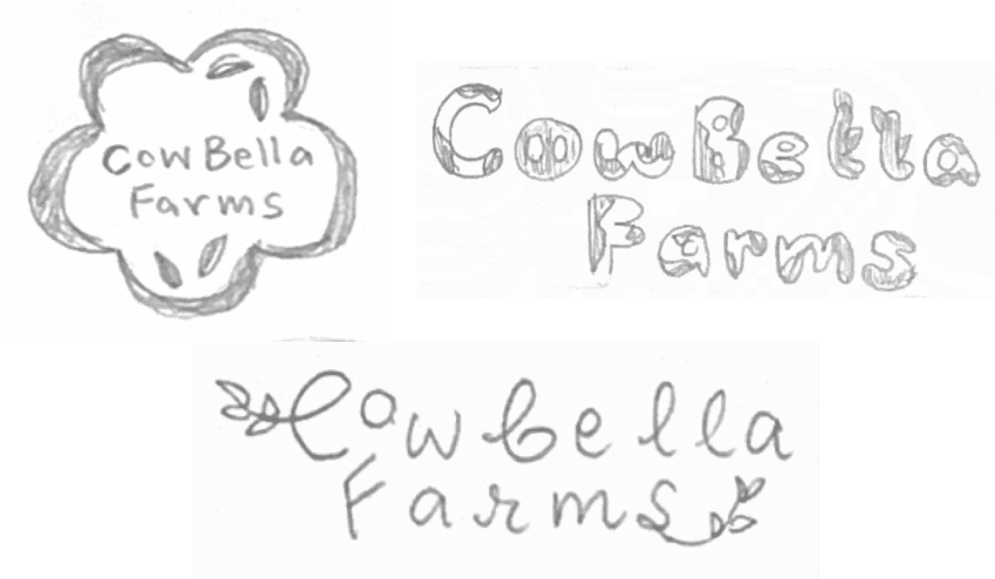
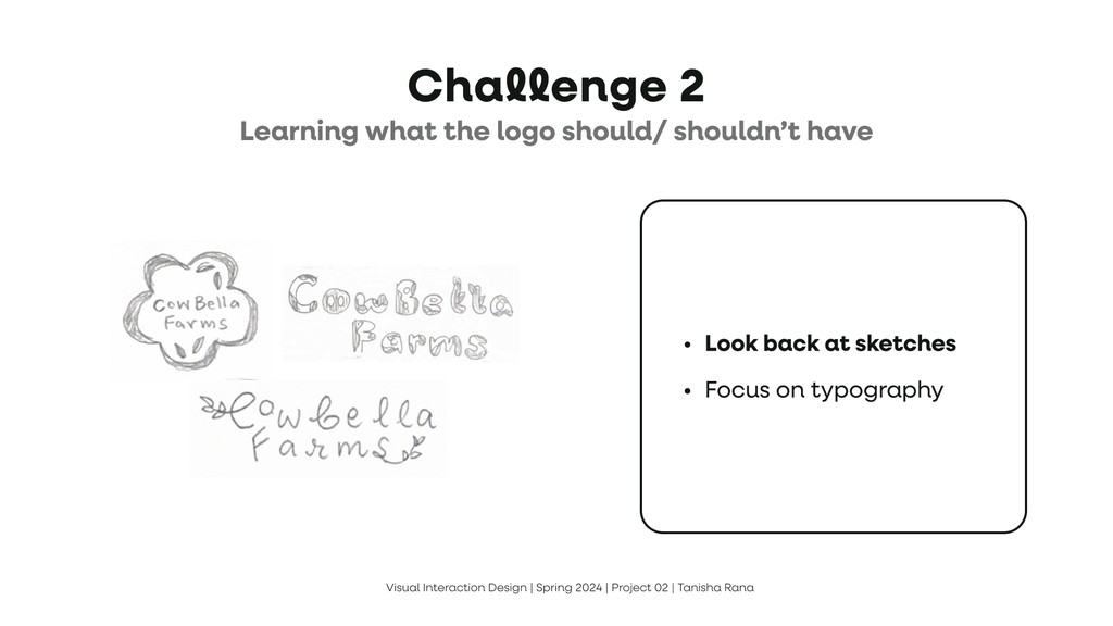
Challenge
Learning the do's and don'ts of logo design
Look back at sketches
Focus on typography

Final Logo
Style guide
How might we cultivate all-natural experiences?

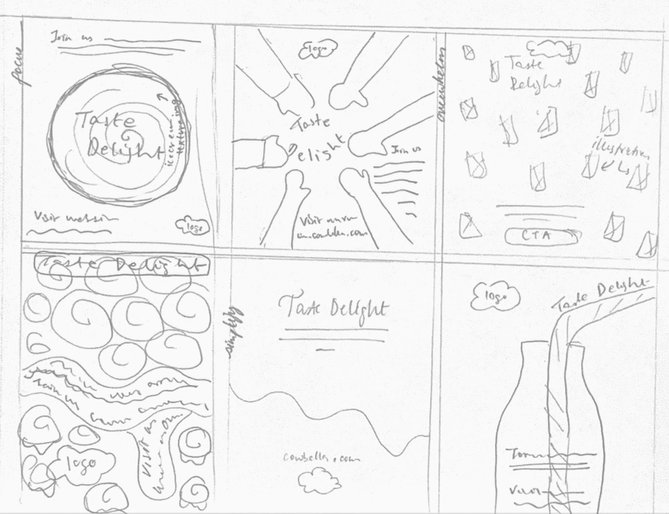
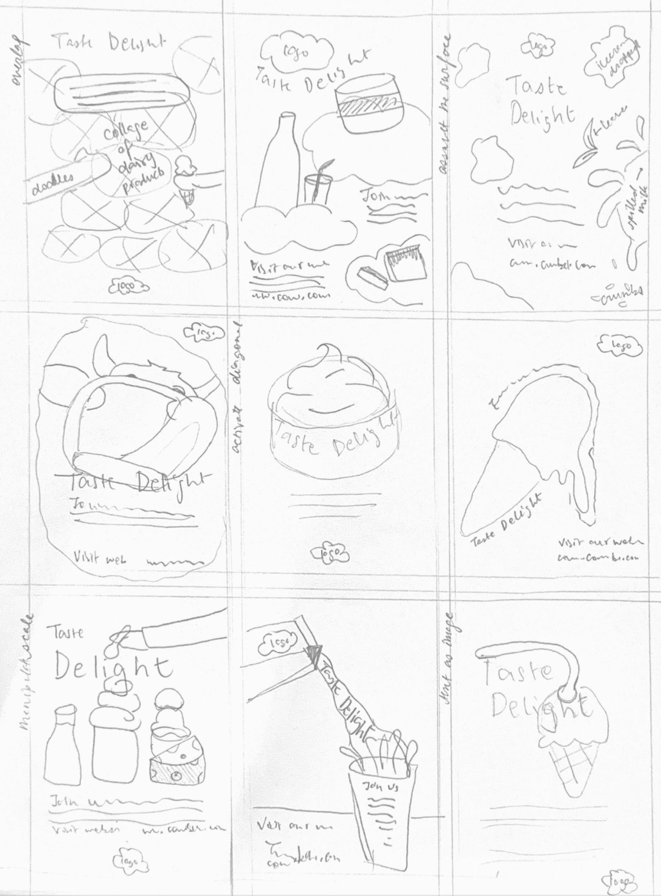
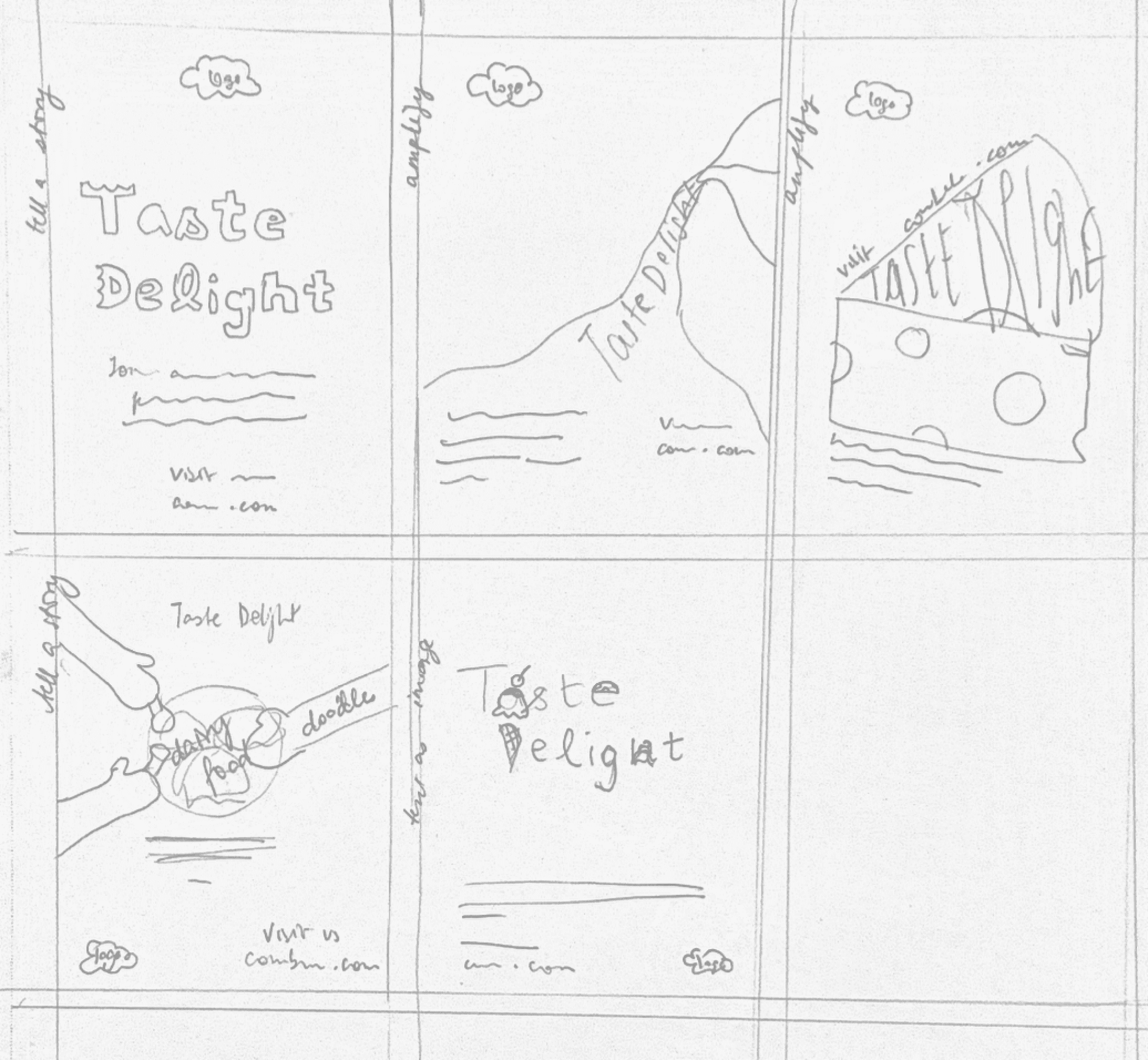
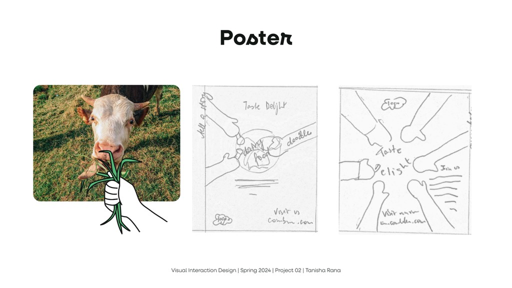
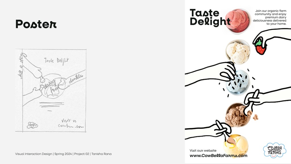
Sketching out ideas for the posters
Sketching out ideas for the posters
Sketching out ideas for the posters
Outcome
This project reinforced the importance of collaboration, especially when working across disciplines. It highlighted that there’s rarely a single solution to a design problem—what matters most is prioritizing the user’s experience. I learned to step back, define clear goals, and focus on designing solutions that are intuitive, adaptable, and user-friendly, no matter the timeframe.
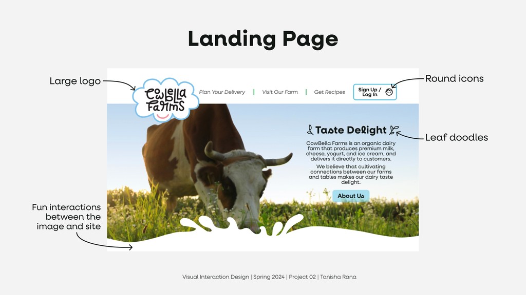
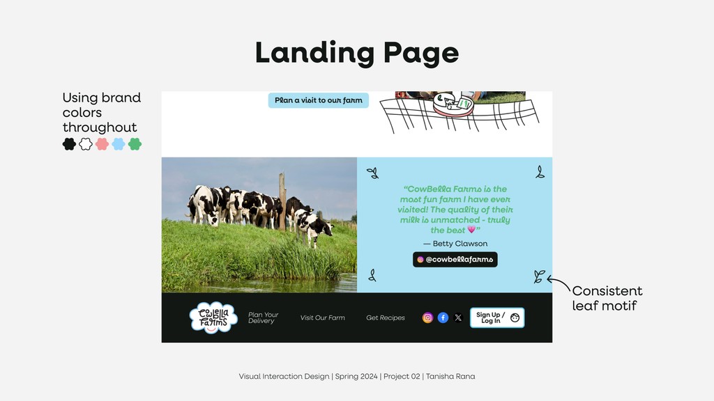
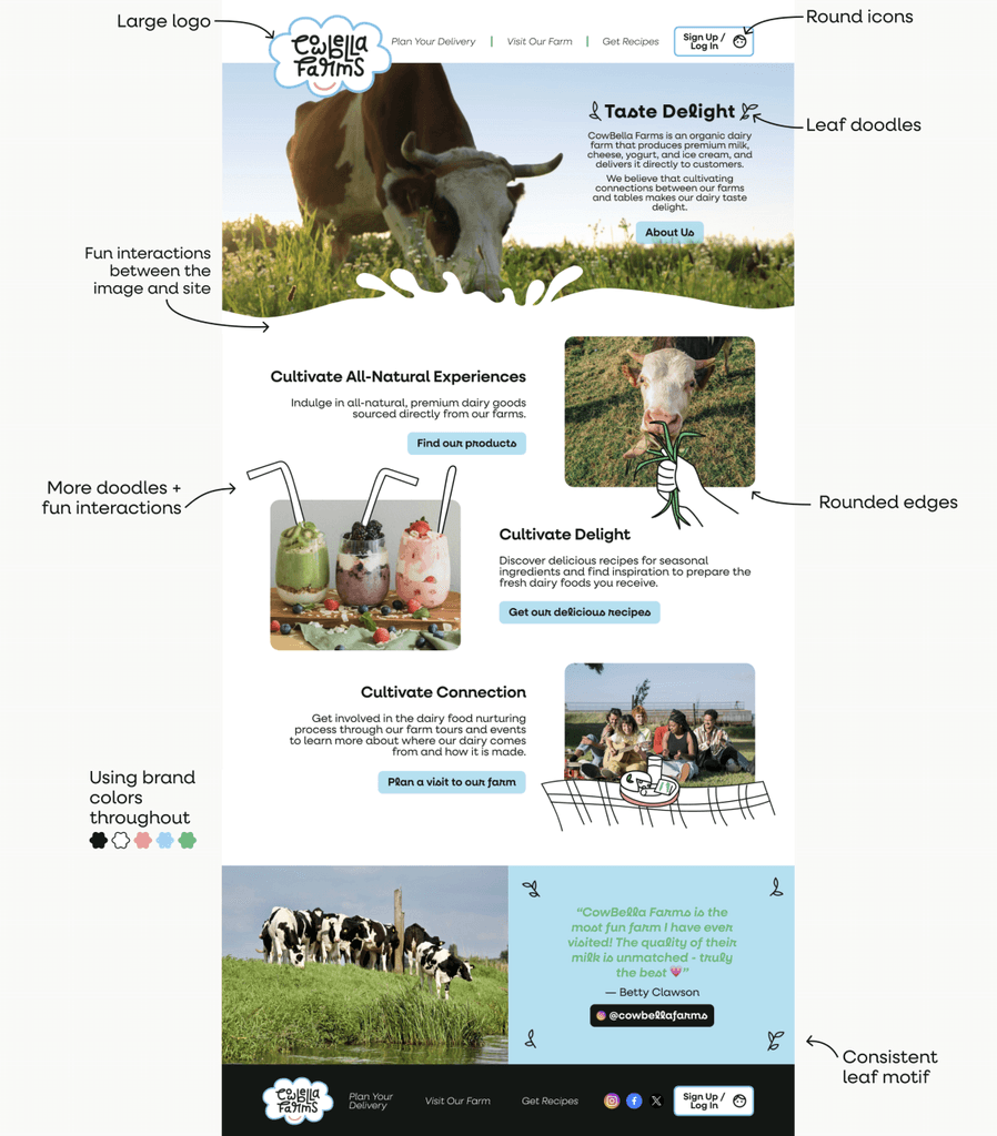
Website
Challenge
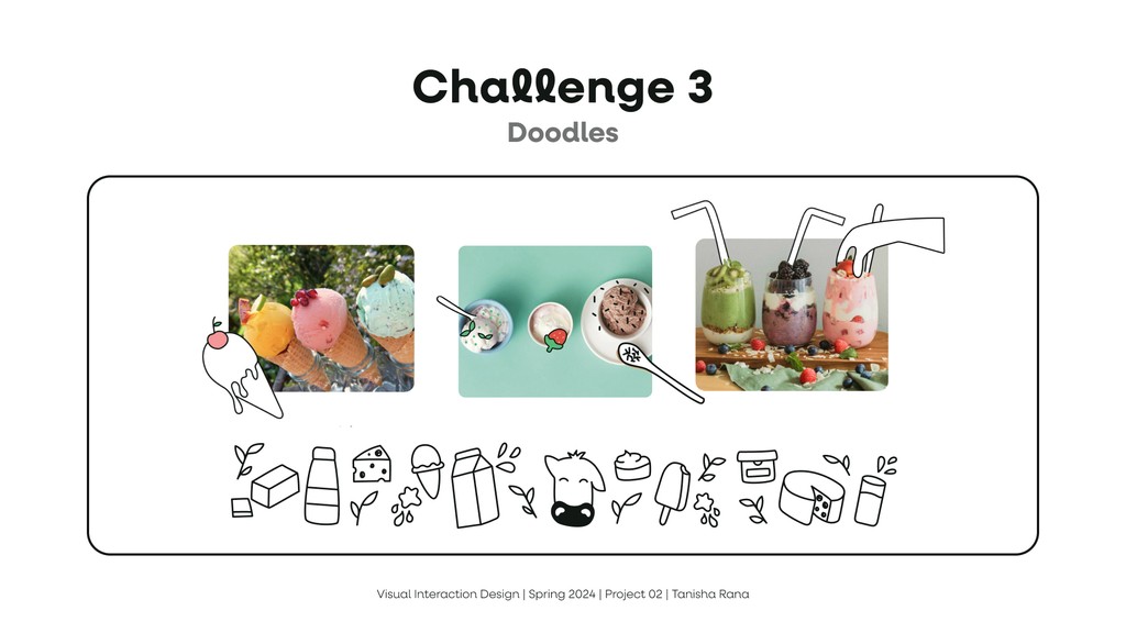
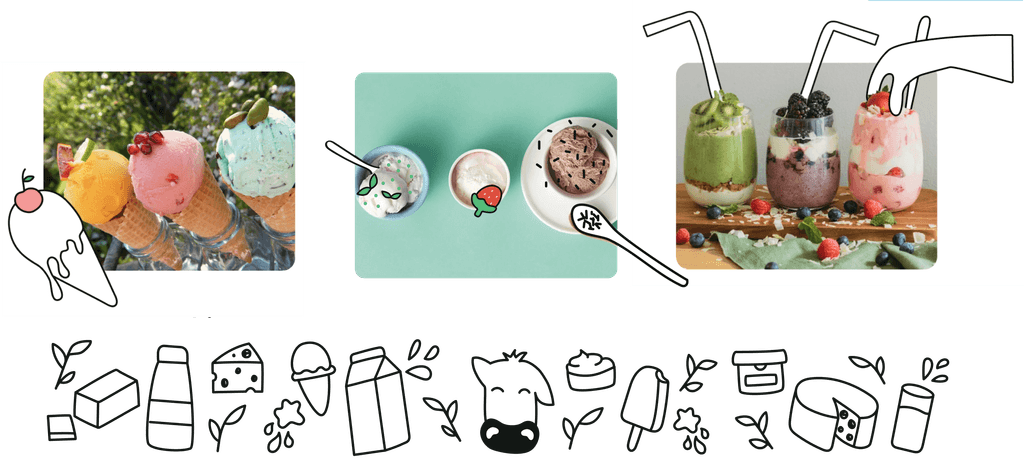
Doodles
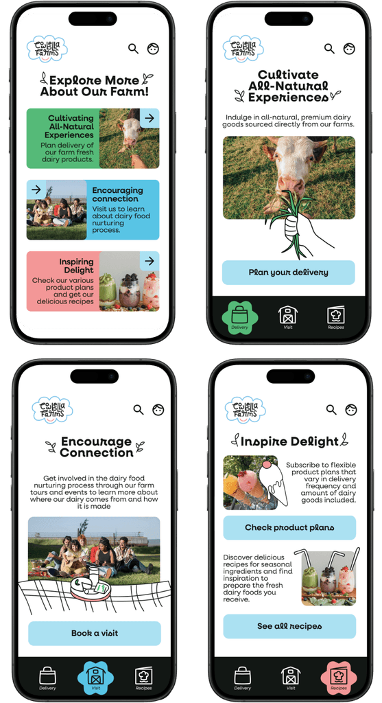
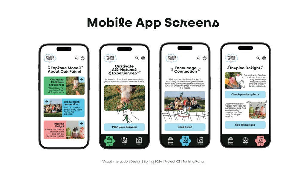
Mobile Screens
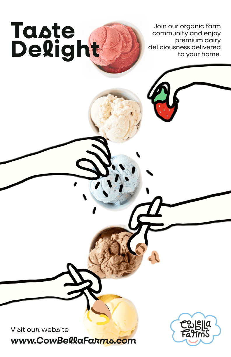
Poster

Takeaways
Looking at touchpoints in their actual size helps
Mobile app screens look different on a slide vs on actual phone. things that look good on paper, won’t look good in figma. By referring to things in their actual size i could perfect tiny things like the font size, bright colors, doodle stroke thickness.
Trial and error
There were many instances where I didn’t like my first drafts like with the moodboard and website. But the more iterations i tried, i found elements that i liked which matches my brand more.
Taking a break before finalizing designs offers fresh perspective
Sometimes when we try too many things in a short period of time we should take a break and look at the design with a fresh mind before finalizing. It makes things easier.
Overall this was a really fun project where I could showcase my drawing skills as well. Power of storytelling through visuals.

© 2025 Tanisha Rana