

Don't Tilt
IoT system to improve student posture and promote healthy work habits.
This project is a personal favorite. It introduced me to the fascinating world of The Internet of Things (IoT) where I experimented with user-centered design, user testing, and planning. Tasked with designing an interactive space using IoT devices, I focused on posture correction, a challenge I personally face. Rather than creating another generic health tracker, I created a system that understands user context, respects privacy, and uses behavioral nudges to make physical well-being feel engaging rather than correctional.
Duration
6 weeks
Role
Solo: Product Designer & Researcher
Tools
Figma, Miro
SKILLS
User Research, System Design, Playful UX
Problem
Students ignore physical health until pain becomes chronic
Students spend hours hunched over laptops, developing musculoskeletal pain and repetitive strain injuries. Existing solutions either nag users with aggressive reminders or require wearable devices people forget to use. The problem isn't lack of awareness—students know poor posture is harmful. The problem is making correction feel natural within their workflow.
How might we
help students maintain healthy work habits through ambient monitoring that respects privacy and enhances rather than disrupts productivity?
Solution
An IoT workspace that makes well-being visible and actionable
I designed a system combining skeletal tracking sensors, pressure monitors, and ambient LED displays to create a workspace that responds to user behavior. The physical space includes an ergonomic chair and adjustable sit-stand table that the system can control. The system provides context-aware guidance through a mobile app with personalized settings, tracks progress over time, and introduces a health bot companion with adaptive personality that makes reminders feel personal rather than corrective.
Core system components:

research
Understanding why students ignore their physical needs
Before designing solutions, I needed to understand the actual problem.
Research Methodolgy
Participant criteria:
Students who work or study in the same position for extended periods—my primary user group.
Research focus areas:
Daily working patterns and duration
Awareness of posture and physical discomfort
Reactions to the proposed IoT monitoring concept
Technology comfort level and privacy concerns
What I Learned
The interviews revealed three critical insights that completely reshaped my initial design:
Privacy concerns override functionality
Students immediately rejected camera-based monitoring, even when told footage wouldn't be stored. The psychological discomfort of being watched outweighed any health benefits—requiring a complete rethink of the monitoring approach.
Users want control, not automation
Students valued customization highly: choosing avatar personalities, notification sounds, and color schemes. They wanted the system to adapt to their preferences, not impose a one-size-fits-all solution.
Reminders must feel friendly, not nagging
The tone mattered as much as content. Students responded positively to playful, encouraging language but disliked anything feeling like scolding or judgment.
With user feedback clear, I restructured feature priorities:
Feature prioritisation
Primary features (core value):
Posture monitoring through skeletal tracking
Movement and stretch reminders based on sitting duration
Secondary features (enhanced engagement):
Hydration tracking and water break prompts
Health bot companion with adaptive personality
Focus mode to minimize distractions during deep work
Key Design Decisions
Solving the privacy problem and creating engaging interactions
Decision 1: Skeletal Tracking Instead of Camera
Students wouldn't use a system that tracked video. I replaced the camera with skeletal tracking technology that monitors body position through anonymous data points rather than identifiable footage. Privacy concerns would have killed adoption—skeletal tracking delivered functionality without psychological discomfort.
Why this mattered: Privacy concerns would have killed adoption. Skeletal tracking delivered the functionality without the psychological discomfort.
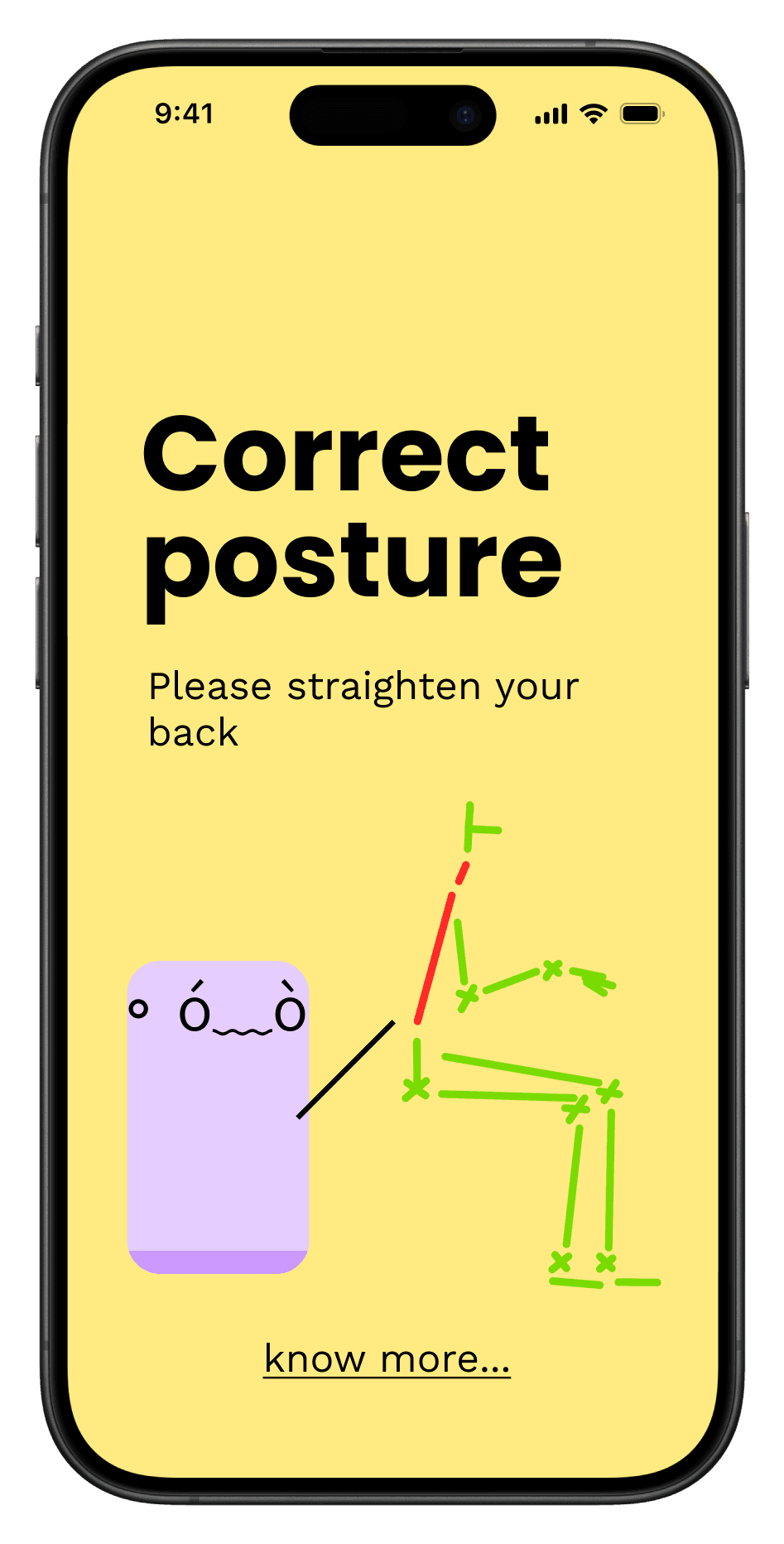
Decision 2: Escalating Visual Feedback System
Rather than binary alerts (good posture vs. bad posture), I designed a progressive notification system using ambient LED colors:
No color: Posture is correct, no intervention needed
Yellow: User has been slouching for 2 minutes—gentle nudge
Red: User ignored yellow alert for 2+ minutes—urgent correction needed
Blue: Hydration reminder—user hasn't had water recently
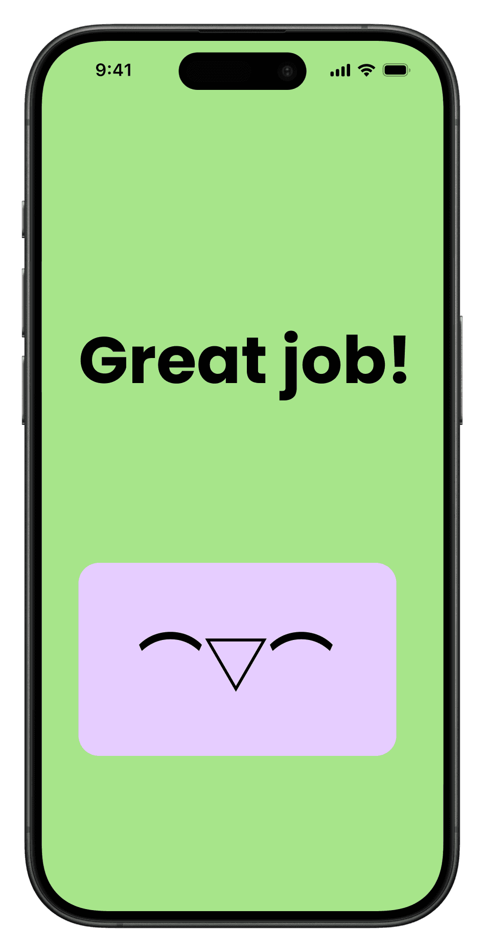
Green: User corrected behavior—positive reinforcement
This non-verbal system lets users understand feedback at a glance without disrupting focus.
Decision 3: Avatar as Emotional Mirror
The health bot companion that acts as a behavior reinforcement mechanism. The avatar's emotional state reflects user actions:
Happy: User maintains good posture or responds to reminders
Concerned: User is developing poor posture
In pain: User has ignored multiple alerts
Sad: User hasn't taken recommended breaks or hydration
This emotional mirroring creates empathy. Users aren't just ignoring an alert—they're ignoring a companion concerned about them.
Decision 4: Adaptive Notification Intensity
The system learns user patterns and adjusts reminder frequency. Consistent responders get fewer notifications; frequent ignorers get more proactive interventions. This respects user agency while providing stronger support when needed.
Mobile App Design
Dual-purpose interface for booking and workspace use
The app transforms based on context:
Booking Mode (Outside Workspace)
When users aren't in the IoT workspace, the app functions as a booking and tracking tool:
Home screen: Displays cumulative posture scores and health metrics
Workroom booking: Reserve IoT-equipped spaces for study sessions
Historical data: Track posture improvement over time

Workspace Mode (Inside IoT Environment)
When the phone is placed on the workspace table, the interface transforms: Displays health metrics, reserves IoT-equipped spaces, tracks posture improvement over time.

Welcome screen: Friendly greeting

Room adjustment: System calibrates sensors for user's height and seating position

Live monitoring: Real-time posture, stress, and hydration indicators

Blank screen option: Minimize distractions during focus periods
This mode-switching required clear visual distinction. The workspace mode uses larger typography, higher contrast colors, and simplified layouts suitable for glancing at from a seated position rather than holding the phone.
Interaction Patterns
Predictable notification sequences
Posture Alert Sequence
Early warning (2 minutes of slouching):
Table display turns yellow
Avatar shows posture diagram highlighting the problem area
No sound interruption—purely visual feedback

Escalation (4+ minutes of slouching):
Table display turns red
Avatar appears in pain
Optional gentle sound alert (user-customizable)


User correction:
Display turns off
Avatar shows happy state
System logs successful behavior change
Hydration Reminder Sequence
Initial reminder:
Table display turns blue
Avatar appears sad
Notification suggests taking a water break

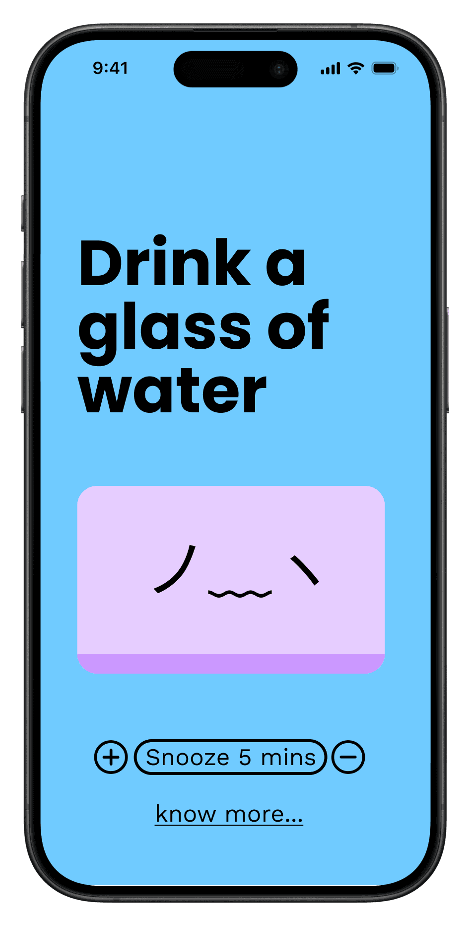
Ignored reminder:
Display turns red
Avatar appears upset
Knowledge base prompt: "Learn why hydration matters for focus"

User action:
Display turns off
Avatar returns to happy state
System resets hydration timer

These sequences create predictable patterns. Users learn the system's logic quickly, making interactions feel natural rather than confusing.
Information Architecture
Organizing complex health data into intuitive flows
I used mindmaps and flow diagrams extensively to visualize user journeys through different scenarios:
If user follows notifications:
Alert → User action → Positive feedback → Return to neutral state
If user ignores notifications:
Yellow alert → Red alert → Avatar distress → Knowledge base prompt


These flow diagrams informed which screens needed design priority. I couldn't design every possible state, so I focused on the core paths that would teach users how the system works.
Visual Design & Color Psychology
Using color as intuitive communication
The usability testing revealed that users form immediate emotional associations with colors. Red universally signaled urgency, yellow indicated caution, and green communicated success. I leaned into these cultural associations rather than fighting them.
Critical insight from testing:
Users initially saw red as the success state because that's what appeared when they took action. This confused the feedback loop. I changed the success state to green, creating clear visual distinction: warm colors (yellow/red) = problem requiring attention, cool colors (green/blue) = positive states or specific needs.
This color system works even when users don't read accompanying text, making the interface accessible to distracted or focused users who only glance at notifications.
Usability Testing
Paper prototypes and spatial walkthroughs
Testing an IoT system without functional hardware required creativity. I created a hybrid testing approach:
Physical space mockup:
I visualized the complete workspace environment, showing where sensors, displays, and devices would be positioned.
Paper prototype LED displays:
I used colored paper to simulate LED notifications, manually changing colors based on user actions during the test scenario.
Interactive Figma prototype:
The mobile app was fully clickable, allowing participants to navigate through actual interface flows.
Testing Methodology
I walked participants through a complete work session scenario:
Booking a workspace
Entering the room and calibrating the system
Working while receiving posture alerts
Responding (or not responding) to notifications
Viewing their health summary
Key Findings
Interface clarity
Users found the mobile screens straightforward and intuitive. The notification hierarchy was immediately understandable.
Color feedback gap
The biggest issue: users expected the success state to use a distinctly different color. Red after taking corrective action felt wrong, even though the text confirmed success. This led to the green success state redesign.
Avatar engagement
Participants responded positively to the avatar's emotional states. Several mentioned they would feel guilty ignoring the sad or hurt avatar, validating the emotional mirroring strategy.
Space Visualization
Designing the complete IoT environment
The physical workspace needed to support the full range of user activities: focused work, stretching exercises, and movement breaks. I designed a room layout that provides:
Work zone: Desk with embedded pressure sensors and skeletal tracking system
Movement zone: Open floor space for stretches and exercises
Resource zone: Water station and exercise equipment within easy reach

The spatial design reinforces the system's purpose—creating an environment where healthy behavior is easy and expected, not an afterthought.
Results & Impact
An engaging health companion that respects user autonomy

The final system delivers posture monitoring through playful, non-invasive interactions. By combining real-time skeletal tracking with adaptive behavioral nudges and emotional avatars, the design transforms health monitoring from clinical surveillance to supportive companionship.
What I delivered:
Complete mobile app with 15+ screens covering booking and workspace modes.
IoT system architecture with sensor integration and feedback mechanisms.
Interaction patterns for posture, hydration, and focus.
Spatial design for IoT workspaces.
While this wasn't built or tested with real users in a functional IoT environment, the project demonstrated that health technology can be engaging without being intrusive.
Reflection
What designing for physical well-being taught me
Playful design creates real emotional investment
The avatar was initially just a visual enhancement. Testing revealed it was the emotional core of the system. Users didn't want to disappoint the avatar, creating intrinsic motivation for behavior change. This taught me that playful elements aren't superficial—they're powerful psychological tools when used strategically.
Test creatively without building everything
This project taught me that usability testing doesn't require functional prototypes. By combining spatial walkthroughs, paper prototypes, and interactive mockups, I could validate design concepts without building expensive IoT hardware. This lo-fi testing approach revealed critical issues that would have been costly to fix in development.
What I Would Do Differently
The biggest limitation was testing outside of real work contexts. I would love to observe users during actual study sessions to see how notifications impact focus and whether the system truly feels ambient rather than disruptive.
I explored adding voice control but cut it due to time constraints. Voice could make interactions even more natural— users could ask their health companion questions without leaving their work. This would strengthen the companion relationship and reduce friction in accessing the knowledge base.
Biggest Takeaway
Behavior change design must balance guidance with autonomy
The most successful interactions informed and suggested rather than commanded and restricted. When users felt in control of the system rather than controlled by it, engagement increased naturally. Any design aiming to change behavior must respect user autonomy while making the desired behavior easier and more rewarding than alternatives— that is the foundation of ethical persuasive design.


