

Planorama
Designing a travel planning tool in 3 weeks with developer constraints
Designed a travel itinerary planner from scratch that balances user needs with real development constraints. Working alongside developer interns who would build the product, I needed to create an intuitive planning experience while ensuring every interaction was technically feasible within our timeline. Worked with 3 developer interns, senior design mentors at Zool.
Duration
4 weeks
Role
Product Designer & Researcher
Tools
Figma, FigJam
SKILLS
Market Research, Interaction Design, Developer Handoff
Challenge
Balancing user experience with technical feasibility under tight deadlines
This project started when developer interns at Zool proposed creating a self-initiated project to strengthen our portfolios. We chose a travel itinerary planner because we saw an opportunity to create something useful while testing our skills under realistic constraints. The real challenge emerged quickly: I had three weeks to design a complete product that three developer interns could actually build.
I was responsible for overseeing the entire design process, from concept to completion. I conducted market research, developed the information architecture, and crafted the final design. Throughout the process, I collaborated closely with senior designers for feedback and worked alongside developer interns to bridge the gap between design and development.

The Problem
Creating intuitive trip planning without overwhelming users or developers
Travel planning is inherently complex. Users need to search destinations, organize activities by day, manage timing and logistics, and visualize their route.
Design challenge
How do you create a travel itinerary planner that's both user-friendly and developer-friendly?
Target Audience
Tech-savvy young adults who
frequently travel and prefer using digital tools to organize their trips. They value intuitive designs that make planning seamless and stress-free.
Understanding the Landscape
Researching competitors revealed what to include and what to cut
I spent the first two days analyzing direct competitors to understand the travel planning space. I looked closely at:


examining their feature sets, interaction patterns, and information architecture.

What I learned
Users valued itinerary creation, integrated search, and map visualization. Many tools offered budget tracking, collaborative features, and AI recommendations, but these added significant complexity.
What I Decided
I needed to narrow scope dramatically. In discussions with the developer interns and senior designers, I cut features strategically. No budget tracking. No real-time collaboration. No AI recommendations. Instead, I focused on three core flows: search destinations, build daily itineraries, visualize the route.


Market research notes showing competitor analysis
This clarity helped me prioritize what would deliver the most value without crossing our three-week timeline.
Defining the Foundation
Building information architecture through collaborative iteration
With scope defined, I mapped out the complete information architecture. This became a working document I shared with the developer interns to ensure we aligned on structure before diving into visual design.
The architecture went through several iterations. Initially, I separated search and itinerary planning into distinct experiences. After discussing with the team, we realized users needed seamless movement between searching and planning. This insight fundamentally changed the flow.
Key structural decisions
Combined search and planning into connected views rather than separate pages.
Established three main sections: home (trip overview), search (find places), itinerary (plan days).
Designed clear pathways between searching for places and adding them to specific days.
Created a persistent itinerary sidebar that stays accessible while searching.

I facilitated collaborative discussions with my team to align on objectives, working closely with developers to ensure the design could be seamlessly coded while balancing visual appeal and functionality.
By Week 2, I had revisited the research with this architecture in mind, validating that our structure matched how our target audience actually approached trip planning.
Wireframing Interactions
Sketching solutions and testing ideas with the team
I started with low-fidelity drawings to explore different approaches quickly. The goal was testing ideas before committing to pixel-perfect designs. Early wireframes focused on the core interaction: how users move places from search results into their itinerary. I sketched multiple variations, sharing them with senior designers for feedback.
What evolved
My first attempts at integrating the map and list views weren't intuitive. I had placed them as separate tabs, which meant users lost context when switching. After reviewing Wanderlog's approach and discussing with mentors, I redesigned this as a split view where users could see both simultaneously.
I also initially missed critical features. The senior designers pointed out that users would need to add personal notes to places and adjust timing for activities. These weren't in my original wireframes because I was focused on the core search-and-add flow. Their experience using tools like Wanderlog highlighted these gaps.


Developer Constraints
Adapting designs to match technical capabilities
Working directly with developer interns shaped the design in practical ways. They were clear about their limitations: no complex animations, no custom map implementations, and everything needed to work responsively across screen sizes.
Design adjustments I made
Simplified interactions
I limited interactions to drag-and-drop and standard selections. No multi-step gestures or complex state management that would require sophisticated JavaScript.
Responsive thinking
I had initially designed for a 13" MacBook because that's what I worked on. When we tested on larger screens, the layout broke. I revised the design system to use flexible grids and established breakpoints for different screen sizes.
Component reuse
I created a modular design system with repeating components. The place cards used consistent patterns whether they appeared in search results, the itinerary, or the shortlist. This made development faster and ensured visual consistency.
These constraints actually improved the design. By removing unnecessary complexity, the experience became more focused and easier to understand.
Design Decision: List vs. Map
Solving the route visualization problem
One of the core design challenges was helping users visualize their daily route. Travelers need to see locations spatially to plan efficient days and avoid backtracking across a city.
I considered three approaches:
1
Map-only provided spatial context but made it hard to see activity details and timing at a glance.
2
List-only showed all information clearly but lost the critical spatial relationships between places.
3
Dual view split the screen, showing the list of daily activities alongside a map with pinned locations.
I chose the dual view because it solved both problems. Users could drag activities in the list to reorder their day while immediately seeing how that affected their route on the map. The map updated in real-time as users added or rearranged places. This decision added technical complexity for the developers, but we agreed it was worth it because route visualization was a core value proposition.
Design Decision: Empty States
Making the first-time experience welcoming
Empty states are often overlooked, but they're the first thing new users see. If the empty page looks broken or confusing, users lose confidence immediately. I prioritized designing thoughtful empty states for every section. When users first create a trip, they see a welcoming screen that explains what to do next. When the itinerary is empty, clear prompts guide them to start searching for places.
Why this mattered
If the design looked good even when empty, it meant the foundation was strong. The visual hierarchy, spacing, and information structure needed to work without relying on user-generated content to make the interface understandable. I used friendly illustration placeholders and clear action prompts. Each empty state communicated what the section was for and what action would populate it.


Design Decision: Notes Feature
Adding flexibility for personal planning needs
During feedback sessions with senior designers, they shared insights from their own travel planning experiences. They consistently mentioned wanting to add personal notes to places—parking information, reservation details, things to remember. This wasn't in my original design because I was focused on the core search-and-organize flow. But their feedback revealed an important use case: travelers don't just need to plan what to see, they need a place to capture contextual information.
The interaction
I added a notes field to each place card. Users could click to expand a card and add freeform text. This was technically simple for developers (just a text input field) but significantly increased the tool's usefulness.
In the collapsed state, place cards show essential information: name of place and time allocated. When clicked, the card reveals the notes field along with more description. This progressive disclosure kept the interface clean while making deeper functionality accessible.


Design Decision: Color Psychology
Using color to evoke travel and exploration
While functionality was the primary focus, I knew visual design would impact how users felt about the product. Travel planning should feel exciting, not bureaucratic.
I chose a sunset-inspired palette with warm oranges, soft pinks, and vibrant accent colors. The rationale was simple: travel is about discovering the colors of new places. The palette needed to feel energetic and optimistic without overwhelming the interface. I went through several color iterations, testing different combinations against the wireframes. Some versions felt too playful and lacked professionalism. Others felt too corporate and drained the energy.

The final palette balanced vibrancy with usability. I ensured sufficient contrast for accessibility while maintaining the warm, inviting feeling that matched the product's purpose.
Refining Visual Design
Polishing screens and creating comprehensive design specifications
The final two weeks focused on translating wireframes into high-fidelity designs and creating the various states and interactions developers needed.
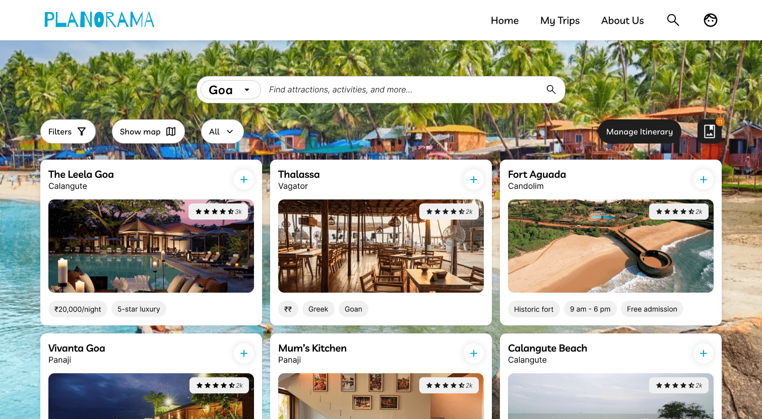
I designed three core pages:
1
Home page
Overview of saved trips with clear calls-to-action to create new itineraries

2
Search page
Integrated search with filters and ability to save places to a shortlist


3
Itinerary planning page
The main workspace where users build daily schedules, reorder activities, and view their route

Itinerary with shortlist page open by default

Itinerary page: focus on changing layout and arrangement of itinerary
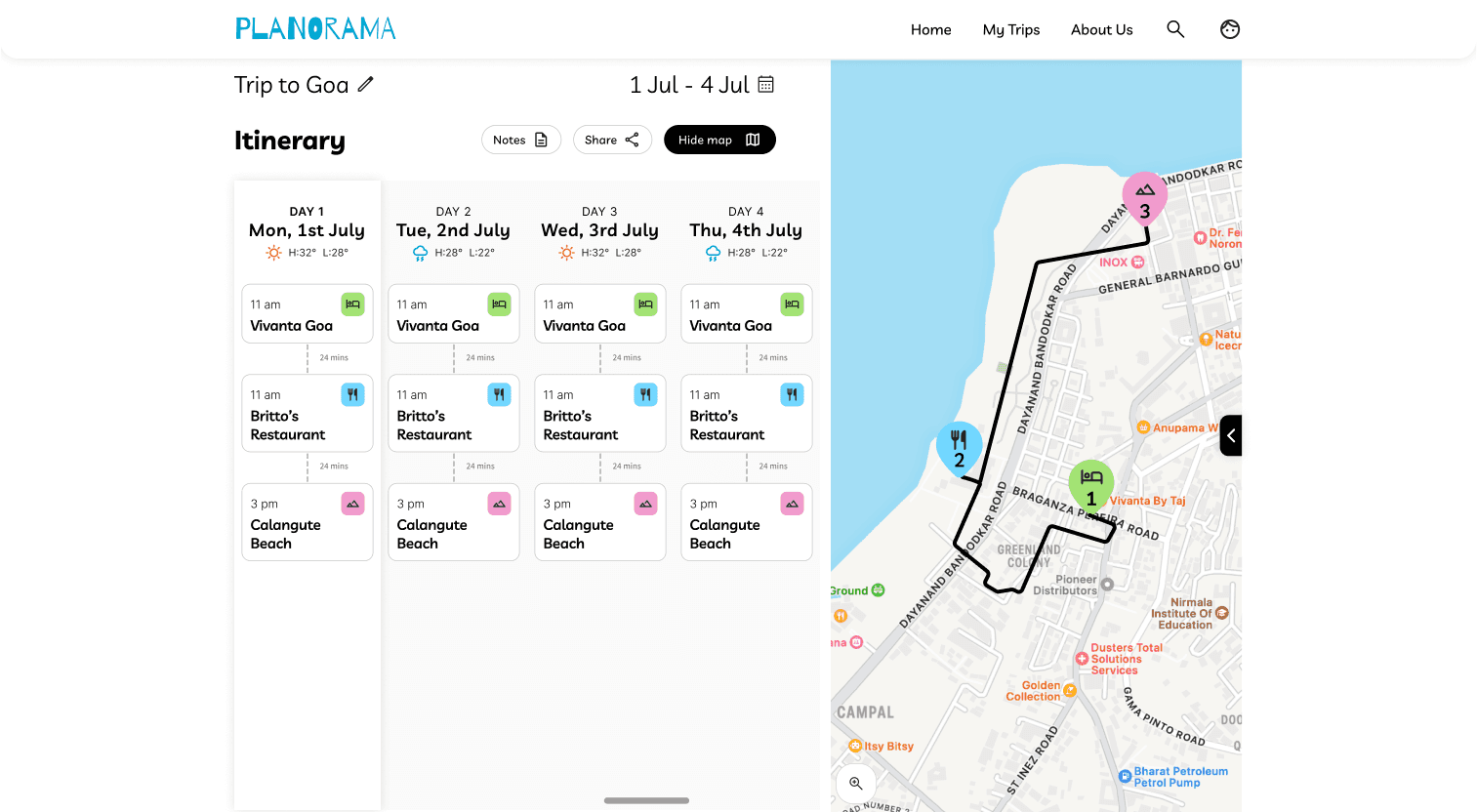
Checking the map for daily activity route
Microinteractions designed:
Filter dialog boxes for refining search results
Detailed cards for hotels, restaurants, and attractions with all relevant information
Time adjustment controls for activities

The shortlist sidebar that persists across pages
Error states and loading indicators
Results and Impact
Shipping a functional product that met its goals
The project delivered on its core objective: creating a working travel planning tool that demonstrated both design and development skills. The developer interns successfully implemented the design and included it in their portfolios. My supervisors provided positive feedback on the collaborative process and final output.
What the design achieved
Simplified travel planning into three clear flows that users could understand immediately
Balanced feature richness with implementability, delivering core value without unnecessary complexity
Created a scalable design system that worked across multiple screen sizes
Demonstrated the value of designer-developer collaboration under realistic constraints
While this wasn't launched to real users it taught me how to design with technical constraints in mind, prioritize features based on user needs and timeline, and communicate design decisions to non-design stakeholders.
Reflection
What this project taught me about design
This was my first experience leading a complete design process from research to handoff, and it reinforced several important lessons.
Design is about tradeoffs
I couldn't build everything users might want. Learning to cut features strategically, focusing on what delivers the most value, was crucial. The temptation was to add more but restraint made the product better.
Constraints drive creativity
Working with developer limitations didn't limit the design, it focused it. Having to think about feasibility from day one made me a better problem solver.
What I would do differently
If I had more time, I would conduct user testing to validate design decisions. Testing the drag-and-drop interaction with real users would have revealed whether the pattern was as intuitive as I assumed.
Finally, I would incorporate AI-assisted features. During this project, AI tools for travel planning were gaining traction. Features like AI-generated itineraries or smart suggestions based on preferences could have elevated the product and demonstrated forward-thinking design.
biggest takeaway
There is rarely ONE perfect solution to a design problem.
What matters is understanding our users, working within our constraints, and making thoughtful decisions we can defend. This project taught me to design with intentionality, advocate for user needs while respecting technical realities, and stay curious about how to improve.


