


Goodreads Evaluative Research
UX research to improve the Goodreads website
In this project, I conducted an in-depth evaluative study of Goodreads, comparing its book-tracking, rating, and organizing features with two competitors. My goal was to assess its usability and identify areas for improvement. Using heuristic evaluations, competitor analysis, and usability testing, I compiled a detailed report with actionable design recommendations to enhance the user experience for book-tracking platforms.
SkillS
Usability Testing
Heuristic Analysis
Competitor Analysis
Tools
Figma
Google Slides
Duration
4 weeks
Course
Design Research: Core IXD Studio
Research Objective
Research Objective
Assessing the effectiveness of Goodreads' features in helping with the tracking, rating, and organization of books that users have already read.
Assessing the effectiveness of Goodreads' features in helping with the tracking, rating, and organization of books that users have already read.
Heuristic analysis
Heuristic analysis
I performed a heuristic evaluation based on Luma Institute’s 10 heuristics. This process involves completing tasks while identifying design choices that could confuse or hinder the user’s actions.
I performed a heuristic evaluation based on Luma Institute’s 10 heuristics. This process involves completing tasks while identifying design choices that could confuse or hinder the user’s actions.
Task list
Task list
Add a book to ‘read’ list
Add a book to ‘read’ list
Rate a book
Rate a book
Check to see the book added to the ‘read’ list
Check to see the book added to the ‘read’ list
Create a new book list
Create a new book list
Heuristic violations
Heuristic violations
I uncovered four major usability issues that disrupted users’ workflows and mental models:
I uncovered four major usability issues that disrupted users’ workflows and mental models:
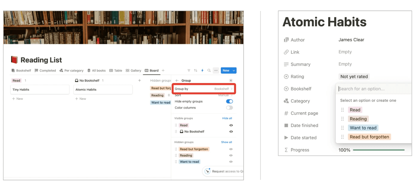
Provide a sense of place
Provide a sense of place
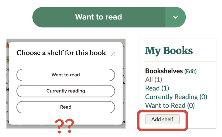
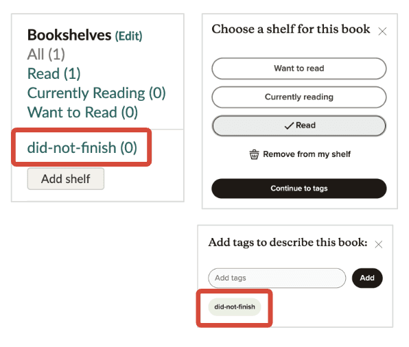
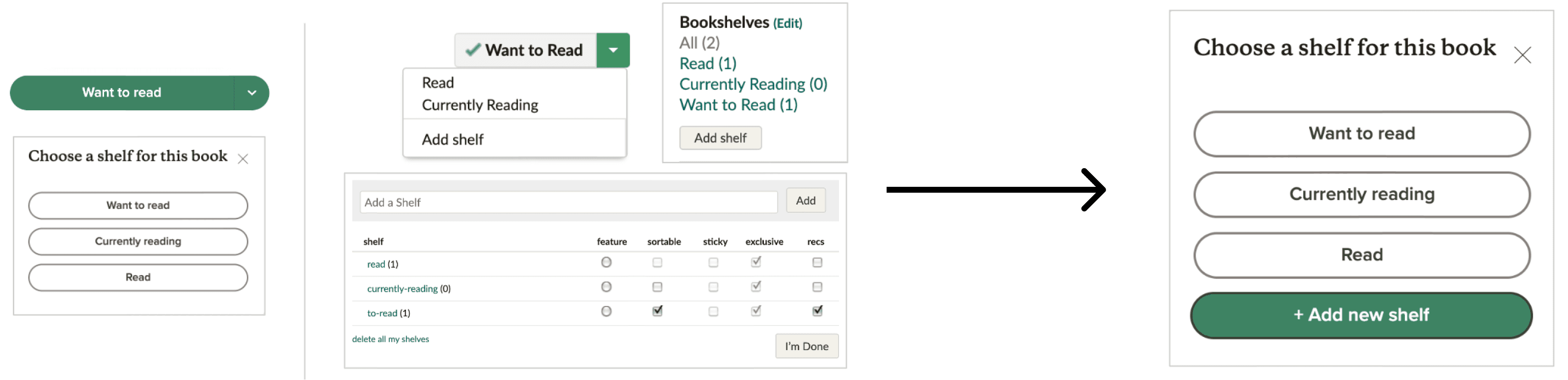
I couldn’t easily add shelves beyond the three default options, leading to confusion about navigation within the system.
I couldn’t easily add shelves beyond the three default options, leading to confusion about navigation within the system.
Use consistent form, words, and actions
Use consistent form, words, and actions
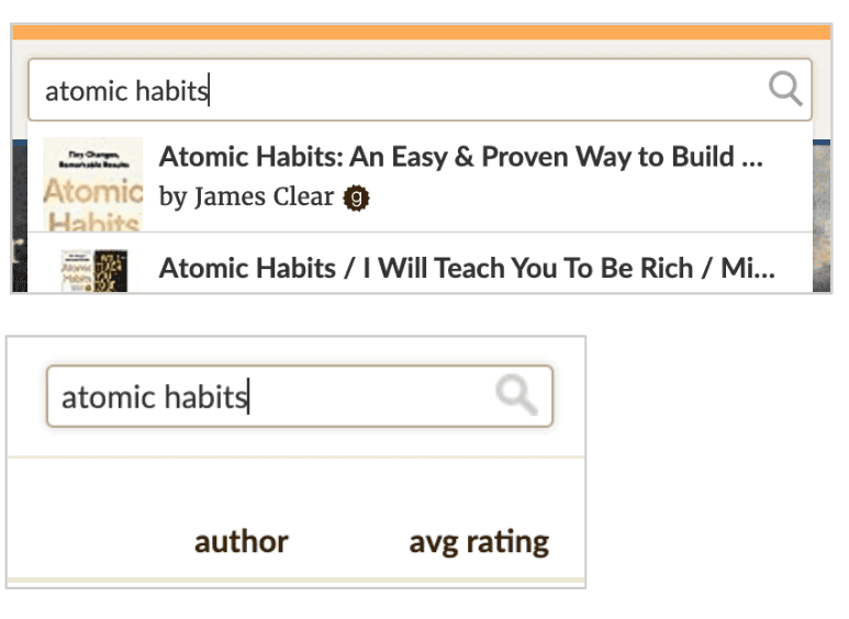
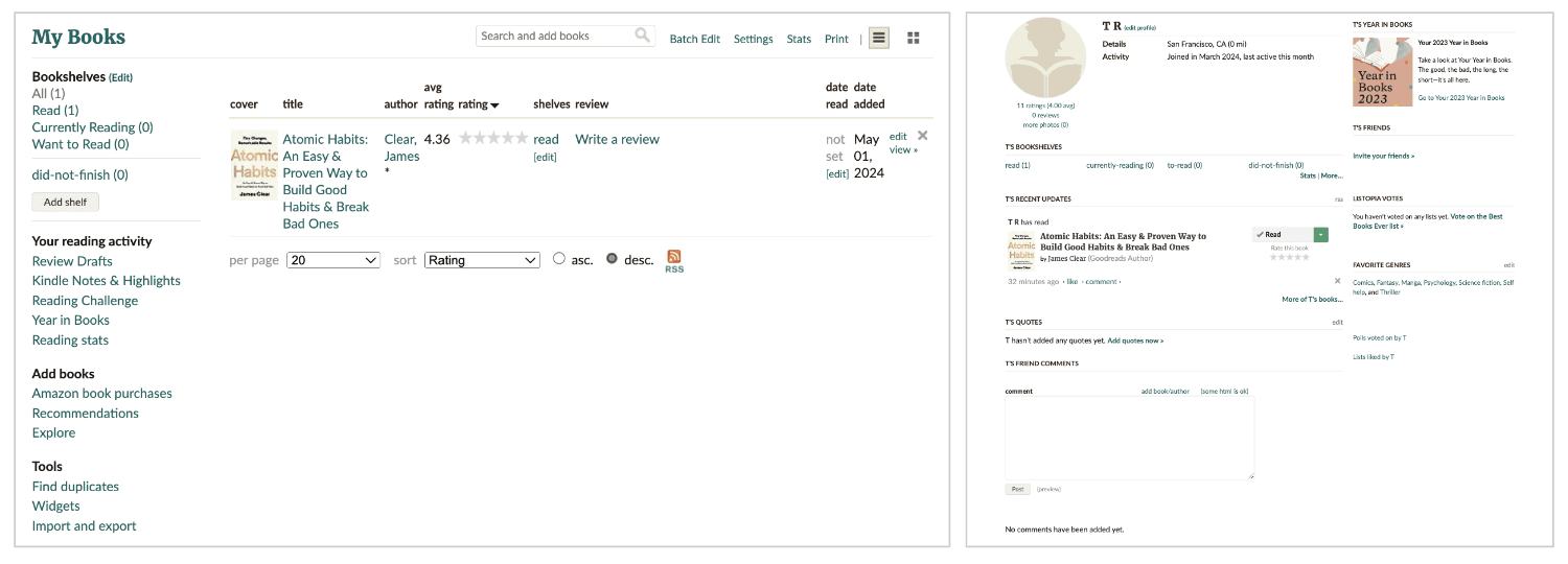
The search bar behaved differently on the “Home” page versus the “My Books” page, causing inconsistencies in actions.
The search bar behaved differently on the “Home” page versus the “My Books” page, causing inconsistencies in actions.
Prevent errors and provide graceful recovery
Prevent errors and provide graceful recovery
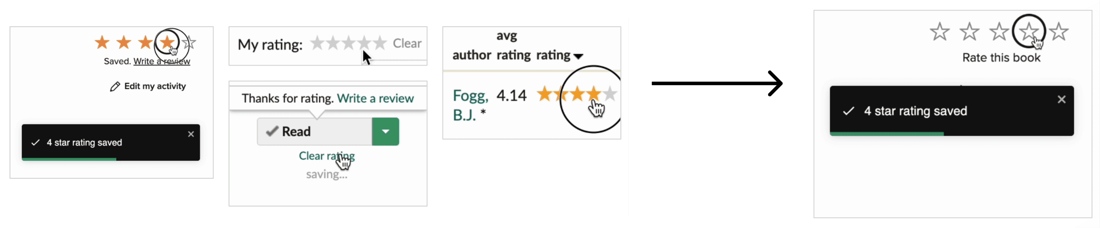
I had to reload the site to see their changes, a frustrating experience that hindered usability.
I had to reload the site to see their changes, a frustrating experience that hindered usability.
Give feedback about actions and status
Give feedback about actions and status
System feedback was often unclear or delayed, making it difficult to understand if their actions were successful.
System feedback was often unclear or delayed, making it difficult to understand if their actions were successful.
Assessment phase
Assessment phase
Competitor analysis
Competitor analysis
To broaden the context, I evaluated two competitors: CandL and Notion. Both offer different approaches to book tracking and organizational tools.
To broaden the context, I evaluated two competitors: CandL and Notion. Both offer different approaches to book tracking and organizational tools.
Both are private, freemium websites
Both are private, freemium websites
CandL
CandL
Non social book tracker
Non social book tracker
Track all books in one place - can make plans, add reviews, and goals.
Track all books in one place - can make plans, add reviews, and goals.
Clean interface; tools always on left sidebar.
Clean interface; tools always on left sidebar.
Subscription required for adding shelves
Subscription required for adding shelves
Intuitive design with clear text hierarchy
Intuitive design with clear text hierarchy
Most usable
Most usable
Notion
Notion
Productivity and note-taking web application
Productivity and note-taking web application
Offers organizational tools like task management, project tracking, to-do lists, and bookmarking.
Offers organizational tools like task management, project tracking, to-do lists, and bookmarking.
Multiple templates available
Multiple templates available
Extensive customization options
Extensive customization options
Requires manual input of book details
Requires manual input of book details
Initial complexity, becomes easy with familiarity
Initial complexity, becomes easy with familiarity
Usable but steep learning curve
Usable but steep learning curve
While both competitors had their advantages, Goodreads had more significant usability issues, which negatively affected user experience and disrupted users’ mental models.
While both competitors had their advantages, Goodreads had more significant usability issues, which negatively affected user experience and disrupted users’ mental models.
Usability testing
Usability testing
I conducted usability testing with participants from different demographics to gather insights into real-world interactions with Goodreads.
I conducted usability testing with participants from different demographics to gather insights into real-world interactions with Goodreads.
Participant Profile
Participant Profile
Number of participants: 6
Number of participants: 6
Demographics: India (3), Mexico (1), UK (1), USA (1)
Demographics: India (3), Mexico (1), UK (1), USA (1)
Gender: 3 Male, 3 Female
Gender: 3 Male, 3 Female
Age: 19-49 year old
Age: 19-49 year old
Criteria: Participants did not have a Goodreads account but were readers (frequency varied).
Criteria: Participants did not have a Goodreads account but were readers (frequency varied).
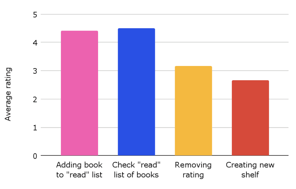
Positive feedback
Positive feedback

Everyone liked the multiple features that Goodreads offers.
Everyone liked the multiple features that Goodreads offers.
They also liked the ease of searching for books.
They also liked the ease of searching for books.
The “Want to Read” button was eye-catching and easily accessible.
The “Want to Read” button was eye-catching and easily accessible.
Negative feedback
Negative feedback

Everyone liked the multiple features that Goodreads offers.
Everyone liked the multiple features that Goodreads offers.
They also liked the ease of searching for books.
They also liked the ease of searching for books.
The “Want to Read” button was eye-catching and easily accessible.
The “Want to Read” button was eye-catching and easily accessible.
Transcript: I think here it would add. Oh. Sorry. My books....my special pages. Uh... Now this is a very... this is going into -0.05 (talking about rating the difficulty of completing the task of adding book to newly created shelf).
Transcript: I think here it would add. Oh. Sorry. My books....my special pages. Uh... Now this is a very... this is going into -0.05 (talking about rating the difficulty of completing the task of adding book to newly created shelf).
This quote highlights the user frustration with basic tasks, like adding a book to a new shelf, due to poor navigation cues.
This quote highlights the user frustration with basic tasks, like adding a book to a new shelf, due to poor navigation cues.
Recommendations based on research
Recommendations based on research
This quote highlights the user frustration with basic tasks, like adding a book to a new shelf, due to poor navigation cues.
This quote highlights the user frustration with basic tasks, like adding a book to a new shelf, due to poor navigation cues.
More research
More research
Based on the usability testing and heuristic evaluation, I identified several areas where additional research is needed to optimize the user experience on Goodreads. These research questions aim to uncover solutions to improve the platform’s functionality and usability:
Based on the usability testing and heuristic evaluation, I identified several areas where additional research is needed to optimize the user experience on Goodreads. These research questions aim to uncover solutions to improve the platform’s functionality and usability:
How can we differentiate shelves and tags for better user understanding?
How can we differentiate shelves and tags for better user understanding?
Users struggled to understand the distinction between shelves and tags. More research is needed to determine how to present these concepts clearly and intuitively.
Users struggled to understand the distinction between shelves and tags. More research is needed to determine how to present these concepts clearly and intuitively.
How can we simplify information retrieval using visual cues or navigation?
How can we simplify information retrieval using visual cues or navigation?
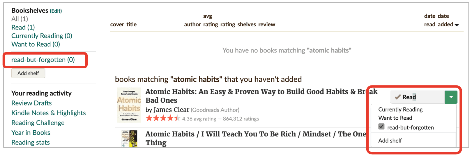
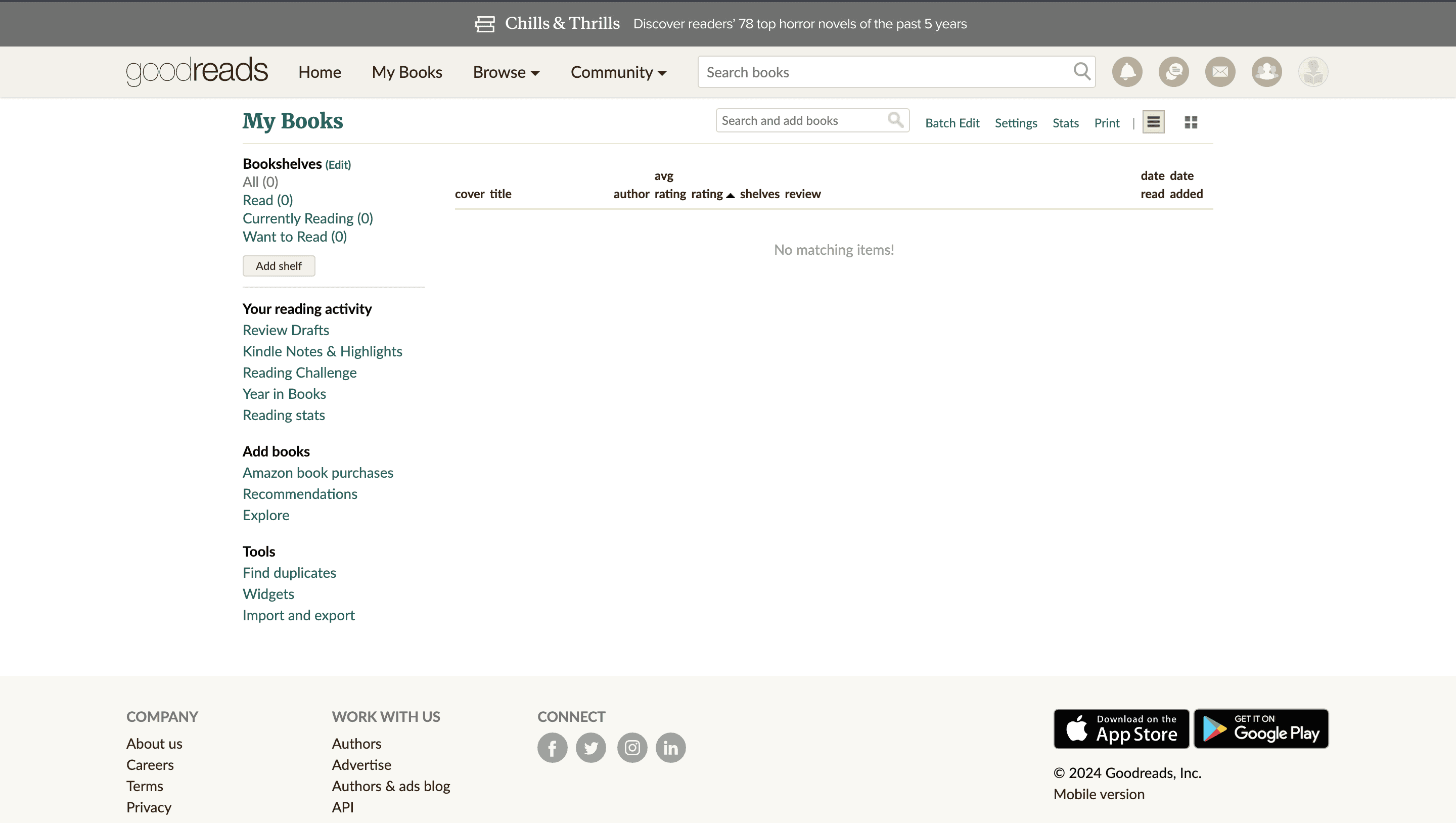
Users had difficulty locating key features, such as the secondary search bar on the “My Books” page. Exploring more effective visual cues or navigational aids could improve the ease of information retrieval. In the video, the visual cues/ navigation were not enough since the participant could not spot the smaller second search bar which says ‘search and add books’ on that ‘My Book’ page, even after looking around it twice.
Users had difficulty locating key features, such as the secondary search bar on the “My Books” page. Exploring more effective visual cues or navigational aids could improve the ease of information retrieval. In the video, the visual cues/ navigation were not enough since the participant could not spot the smaller second search bar which says ‘search and add books’ on that ‘My Book’ page, even after looking around it twice.
What is the best order to place items in the “Want to Read” shelves button?
What is the best order to place items in the “Want to Read” shelves button?
It is unclear which organizational structure for the “Want to Read” button would best suit users’ needs. Research should explore different layouts or default orders to improve usability.
It is unclear which organizational structure for the “Want to Read” button would best suit users’ needs. Research should explore different layouts or default orders to improve usability.

Is there a more efficient method than the “Edit My Activity” option?
Is there a more efficient method than the “Edit My Activity” option?
The current process for editing user activity requires several steps and page reloads. Investigating alternative, more efficient methods could streamline the user workflow, there could be quicker ways to let them take actions without page redirection.
The current process for editing user activity requires several steps and page reloads. Investigating alternative, more efficient methods could streamline the user workflow, there could be quicker ways to let them take actions without page redirection.

Would it be helpful to combine the “My Books” and “Profile” sections?
Would it be helpful to combine the “My Books” and “Profile” sections?
This needs wider cultural research since all 3 participants from India used the “Profile” option to navigate to shelves whereas the 3 participants from other parts of the world used the “My Books” tab. Further research can determine whether merging these sections would reduce navigation confusion and improve the overall user experience.
This needs wider cultural research since all 3 participants from India used the “Profile” option to navigate to shelves whereas the 3 participants from other parts of the world used the “My Books” tab. Further research can determine whether merging these sections would reduce navigation confusion and improve the overall user experience.
Make removing rating easier
Make removing rating easier
Instead of using different design styles for the same UI pattern, use the most successful one.
Instead of using different design styles for the same UI pattern, use the most successful one.
Change the “Add Shelf” button
Change the “Add Shelf” button
Improve the visibility and accessibility of the “Add Shelf” button to reduce user frustration.
Improve the visibility and accessibility of the “Add Shelf” button to reduce user frustration.
Final thoughts
Final thoughts
Diverse approaches to tasks exist
Diverse approaches to tasks exist
There are many ways of doing the same tasks and research helps us come across such fascinating findings.
There are many ways of doing the same tasks and research helps us come across such fascinating findings.
Preparedness for guiding lost participants
Preparedness for guiding lost participants
For my next research, I would think about what to say in cases where the participants feel lost. This time I struggled to answer their questions without leading them on/ directly guiding their actions.
For my next research, I would think about what to say in cases where the participants feel lost. This time I struggled to answer their questions without leading them on/ directly guiding their actions.
Embracing questions in research
Embracing questions in research
Research fuels research. I learnt that it is okay to have questions at the end of the research since it shows that there are more things to be explored.
Research fuels research. I learnt that it is okay to have questions at the end of the research since it shows that there are more things to be explored.